Drawing correct letterforms + FREE Guide

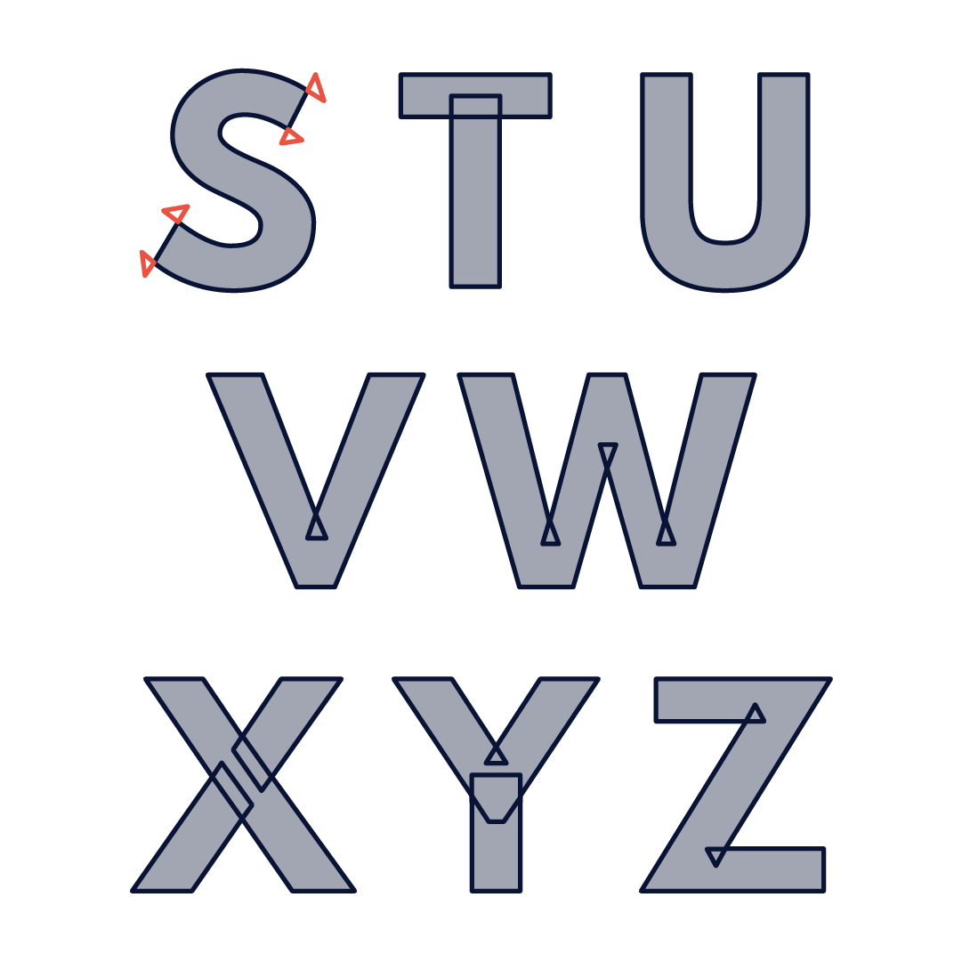
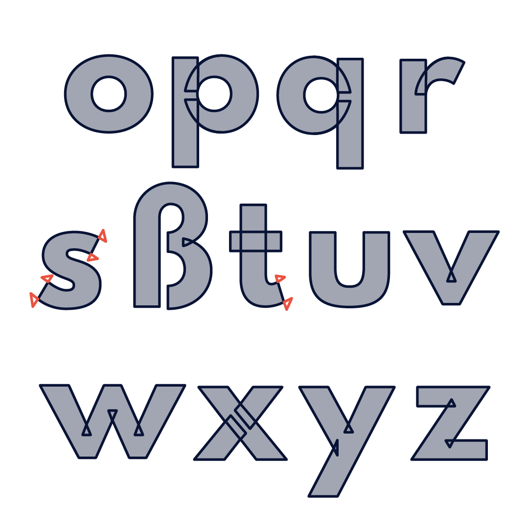
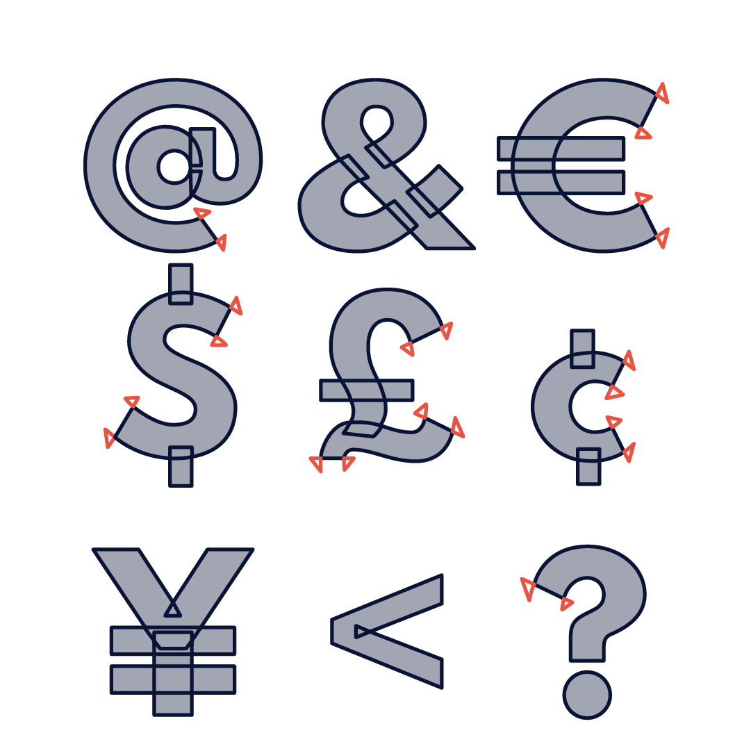
When you draw your letterforms you have to keep in mind that you use as few points as possible, while maintaining as much possible control over the shape of your lines. In Type Design software like Glyphs, which we use in our Type Design Courses, you can use Open Corners on curved paths like in the C, this allows you to move the end stoke along the curve. Super handy to quickly change the shape of your character and keep the curves. Keep in mind that this does not work in Adobe Illustrator.

If you want to keep this guide as a reference sheet, scroll down for a pdf version.

Download your FREE Correct Letterform Guide here


Hello, my name is Viktor Baltus,

I help aspiring graphic designers turn their font-making dreams into reality. I love nothing more than helping you with the process of sketching, designing, using, and selling your own fonts. My methods of teaching are always super clear, no fuzz and fluff, and help you grow as a designer, by picking up new design skills or updating your knowledge.


Donate to The Coffee Fund

Have you received help with your font, letterforms, or did I answer your burning type or design question? Do you want to return the favor, but are you not sure how to do that?

You can always buy me a coffee or a bag of beans, you decide, whatever you think my help was worth to you. Please feel free to make a donation to the Coffee Fund.


Previous
Previous

Best Glyphs Plugins

Next
Next

Color Fonts with Fontself