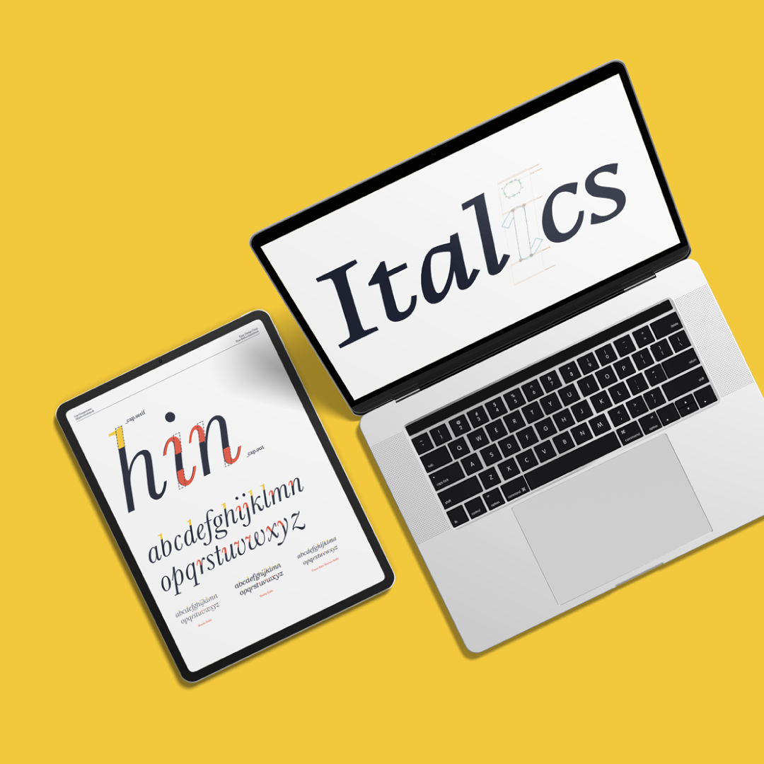
Your font has a Regular. Now give it a proper Italic.
A good italic is not simply a slanted version of your Regular. In the True Italics Course, I’ll show you how to design an italic that actually belongs to your typeface.
✓ Italics that match your uprights
✓ From drawing by hand to digital
✓ Help along the way
$249
Watch the trailer
We’ve created 7 What’s New videos that are added to our existing courses. These videos introduce you to the new features and changes in Glyphs 4, so you can start using the new version right away.



Your Regular font deserves better than an Oblique button
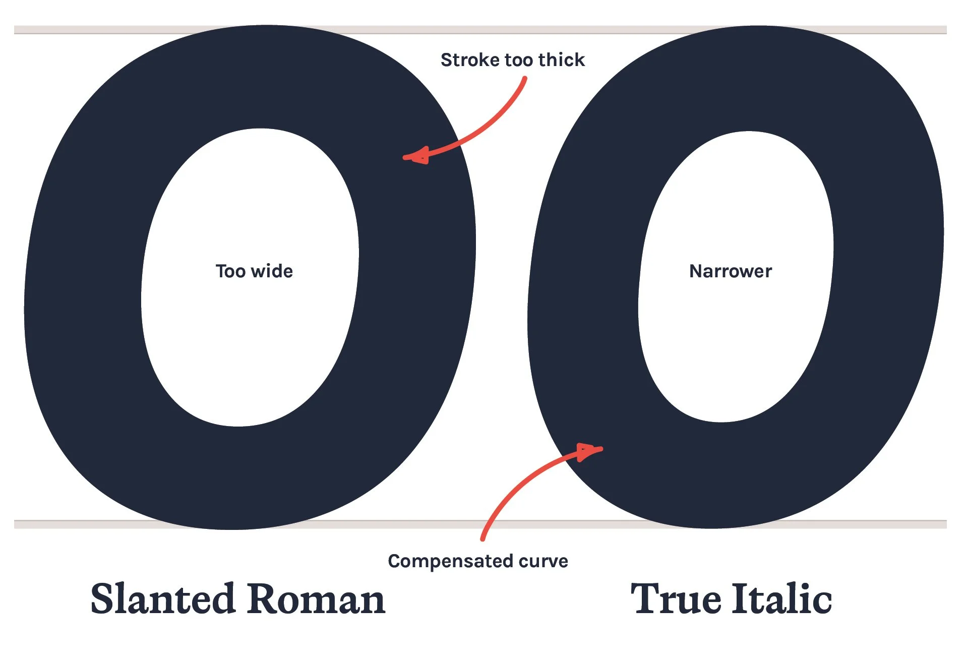
True italics have their own rhythm, proportions, construction and movement.
You’ll learn what changes when a Regular becomes an italic, which parts of a letter need to move, which parts need to stay put, and how to make those decisions consistently across an entire typeface.
We’ll start with pencil and paper before moving into Glyphs 4, so you understand the shapes before worrying about Bézier points.
By the end, you’ll know how to build a complete italic companion to your Regular font, rather than simply applying a slant.
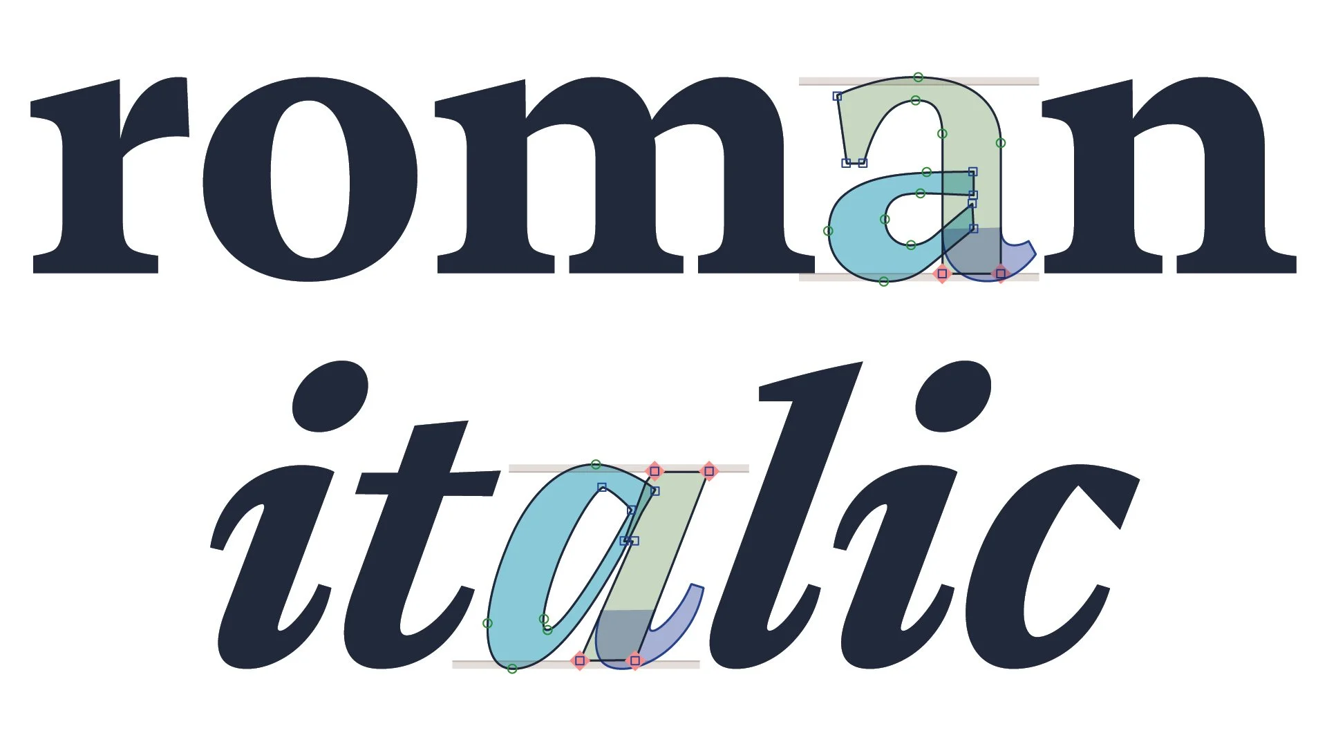
A new construction
If you’ve already made a typeface, you probably know the feeling.
You select all the letters, apply a slant, start adjusting a few curves and suddenly you’re wondering why the italic looks strangely lifeless.
That’s because true italics involve much more than changing the angle.
Some letters need completely new constructions. Some strokes need to change direction. Curves need compensation. Widths change. Connections become more important. Some upright shapes simply don’t belong in an italic.
The course breaks all of this down into manageable steps, so you can see what is happening and, more importantly, understand why.
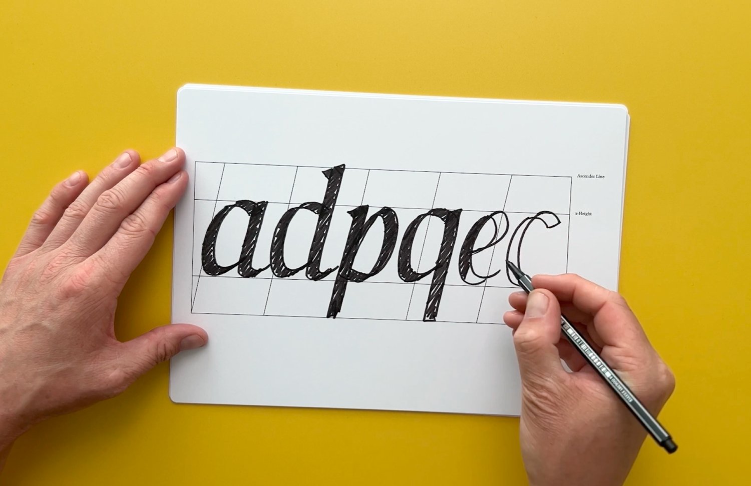
We start with two pencils.
Before opening Glyphs 4, we’ll draw.
Using a simple double-pencil technique and a calligraphy template, you’ll explore the movement, construction and stroke logic behind italic letterforms.
You’ll draw uppercase and lowercase letters, figures, symbols and the infamous italic ampersand.
This gives you something much more useful than a collection of rules: a way of looking at italic letterforms. Then we take those ideas into Glyphs and build the typeface digitally.

Valerie Maas
“What an incredible course this turned out to be! Informative, practical, and above all, a lot of fun to follow. Highly recommended!”
You don’t need to be a calligrapher
You do need some experience with font making and Glyphs. The course is designed for people who have already made Regular fonts and want to take the next step into italics.
If you haven't made a font before, start with the Font Making Course first.
If you already have a Regular font sitting on your hard drive thinking, “So... when are we getting an italic?”, you're in the right place.
What you’ll need for this course:
✓ Mac Computer (Glyphs only runs on Mac OS)
✓ Glyphs 4 installed

Feedback & Support along the way
Are you feeling stuck with a particular technique or module? If so, feel free to ask me anything about the modules, directly within the context of your learning experience. I’m here to help.
From first sketch to finished italic
What you’ll get

8 step-by-step modules
More than 3 hours of step-by-step video lessons
60-page guidebook
Background information, exercises and practical templates to work through alongside the videos

Ask Me Anything
Are you feeling stuck with a particular technique or module? If so, feel free to ask me anything about the modules, directly within the context of your learning experience. I’m here to help clarify any confusion and support your understanding.
What’s
inside
The breakdown of this course
-
Learn what makes italics unique. This module covers the history of italic fonts and why they matter in typography.
1.1 — Introduction to the course
1.2 — History of Italics
1.3 — Oblique vs true italic
1.4 — Italics in serif and sans serif
-
Start your with paper and pencil, or should I say pencils as we’ll use a double pencil technique. Discover how sketching helps bring your ideas to life before moving to the computer.
2.1 — Form follows ductus
2.2 — Drawing uppercase letterforms
2.3 — Drawing lowercase letterforms
2.4 — Drawing figures and symbols
2.5 — Drawing the Italic ‘g’
-
Get clear on the first steps in creating a typeface. This module guides you through starting your italic design project smoothly.
3.1 — What slant to use
3.2 — Straight letterforms
3.3 — Round letterforms
3.4 — Angled letterforms
-
Learn how to set up your typeface in Glyphs 3. This module shows you how to organize and manage your designs efficiently.
4.1 —Setting up Italic Master
4.2 — Components and reusing shapes
4.3 —Helpful Plugins and scripts
-
Discover the difference between creating oblique and true italics in Glyphs. This module explains how to construct all characters.
5.1 — Slants in characters
5.2 — Briem Method
5.3 — Oblique Sans Serif
5.4 — In-strokes and out-strokes
5.5 — Uppercase
5.6 — Lowercase
5.7 — Digits
5.8 — Punctuation
5.9 — Uprights in Italics
-
Explore the advanced features of OpenType fonts. Learn how to add special characters and effects to make your typeface stand out.
6.1 — What are OpenType features
6.2 — Stylistic Sets
6.3 — Historical forms
6.4 — Ligatures
6.5 — Historical ligatures
6.6 — Swashes
-
90% of your kerning issues can be resolved with good spacing. This module helps you make your typeface look neat and balanced.
7.1 — Spacing
7.2 — Kerning
7.3 — Kerning Groups
By the end, you’ll be able to ...

Understand why certain italic forms work and others don't

Build a complete italic master in Glyphs 4

Construct italic letterforms instead of simply slanting existing ones
This is for you if
✓ You have already designed a Regular typeface.
✓ You know the basics of Glyphs.
✓ You have tried making an italic but aren't happy with the result.
✓ You want to understand the difference between an Oblique and a True Italic.
✓ You want a repeatable process for creating italics in your own typefaces.
This isn’t for you if
✗ You're looking for a general introduction to font making.
✗ You've never worked with Glyphs before.
✗ You want to design Arabic, Cyrillic or Devanagari italics.
✗ You just want to press a button and generate an italic automatically.
This course is about designing the italic yourself and understanding the decisions behind it.
What people say about my courses
-
![Close-up of a man with curly brown hair, glasses, and a beard smiling outdoors.]()
"I absolutely love the Font Making Course, and find myself returning to the lessons regular. There’s so much knowledge to glean here!"
Elliot Jay Stocks
-
![Black and white portrait of a woman with wavy hair, looking thoughtfully at the camera with her hand near her neck, next to curtains.]()
"I'm so grateful to have taken this course, because without Viktor I wouldn't be where I am today."
Stacy ‘Blanc Salváge’
-
![Black and white portrait of a man with curly hair looking to the side.]()
"I would highly recommend this course if you're serious about type, it will make you love it even more!"
Adam Vicarel
-
![A young woman with short, styled hair, multiple earrings, and a septum piercing, resting her chin on her hand, smiling softly at the camera.]()
"I’m super happy with the course! I’ve created a typeface before, but following your process has definitely sped up my workflow, and I’ve discovered so many new tips that make this journey a bit easier!"
Mari Carmen del Valle
-
![A young man with short dark hair, a goatee, and a slight smile, wearing a dark shirt, sitting indoors near a window with natural light.]()
"Besides the very detailed structured course Viktor gives invaluable feedback. This is the perfect combination."
Michael Leonhartsberger
-
![A woman with short, wavy dark hair wearing a black top, smiling slightly against a white background.]()
"The course is full of useful knowledge and tips to learn and yet it is explained simple and easy to follow. So I was able to learn it step by step without being overwhelmed."
Saori





Meet your teacher
Hi, my name is Viktor.
I've taught more than 2,500 creatives how to make fonts, and I've spent a lot of time figuring out how to explain the things that usually make type design feel unnecessarily complicated.
The True Italics Course is focused on one thing: helping you understand how to design an italic that works.
No giant textbook. No 40-hour video library. No mysterious type-design rituals.
Just a clear process, practical demonstrations and plenty of letterforms to draw.
Frequently Asked Questions
-
Yes. Once you’re enrolled, you have the flexibility to start at your own pace, whether that’s next week, a few months down the road or even next year.
I want the courses to fit into YOUR schedule, not the other way around.
-
Yes. We have added subtitles in English, Spanish, German and French. Please note that the German and French subtitles have been generated automatically and are still in Beta. Over time these will be checked by native speakers.
-
Yes! With the online True Italics Course you can learn at your own pace, in your own time, anywhere in the world. Stuck with a technique? Simply scroll back in time and start over.
-
Best to take this course if you already have some experience with font making. Take the Font Making Course first. I will teach you all the steps you need to take to create your own professional font.
-
This course is focused on Western European Latin languages. That includes English, your basic upper- and lowercase, and everything beyond like punctuations and diacritics. We do not draw Arabic, Cyrillic, or Devanagari characters.
-
You can order your course on this page. You will receive an email with links and instructions for accessing the course material.
-
Let’s be honest, ‘life long access’ is not something you can really claim. You’ll have access to the course material for a minimum of 5 years, or as long as it is relevant to Glyphs software.
-
I understand the confusion, glyphs with a lowercase are what you design in a font file. Glyphs with an uppercase is the software, also referred to as Glyphs App, or Glyphs 3.
-
The price is shown without VAT because some customers (e.g., businesses) can reclaim VAT, and VAT rates vary by country. The total price, including VAT, will be shown at checkout based on your location. Please fill in your Business Vat ID upon checkout.
Any additional questions? Feel free to email us at info@typedesignclass.com
Ready to give your font an italic?
Your Regular already exists. Now make an italic that actually belongs with it.
True Italics Course
✓ 8 modules
✓ 3+ hours of video
✓ 60-page coursebook
✓ Instant access
$249
