The Humanist Blueprint
Draw your own Humanist typeface with a solid foundation. With uppercase, lowercase, figures, punctuation, accents and diacritics, italics & swashes.
✓ Easy to learn with helpful video
✓ Start now, at your own pace
✓ Gain full control of your letterforms
✓ Grow your font making skills
$49
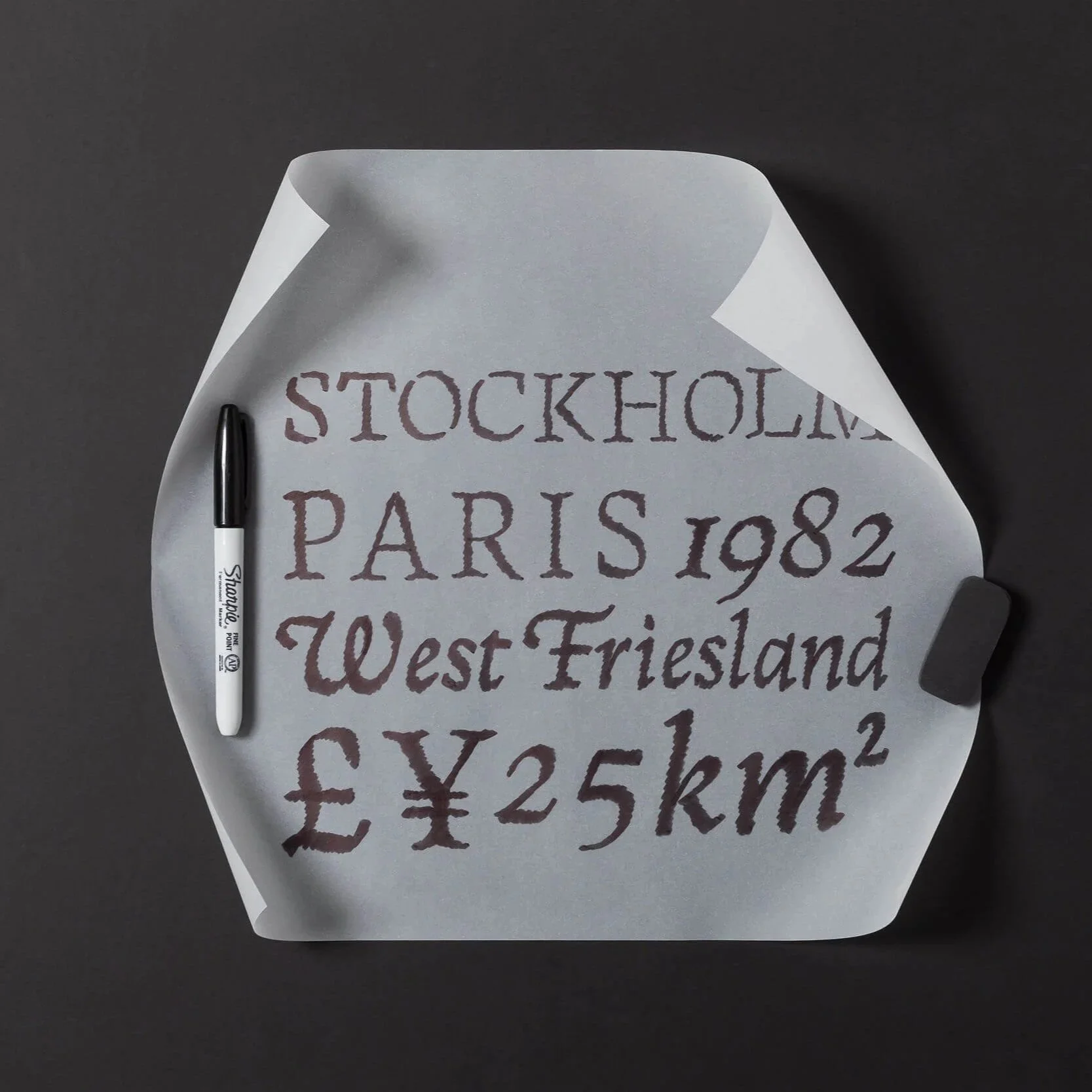
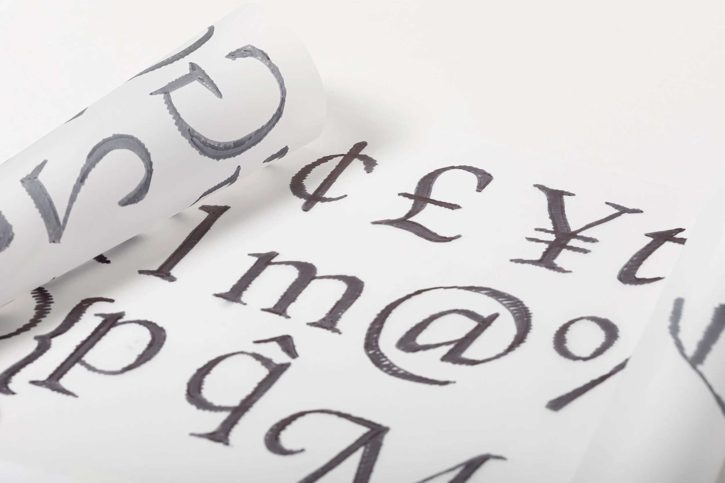
Create fonts with a Human touch
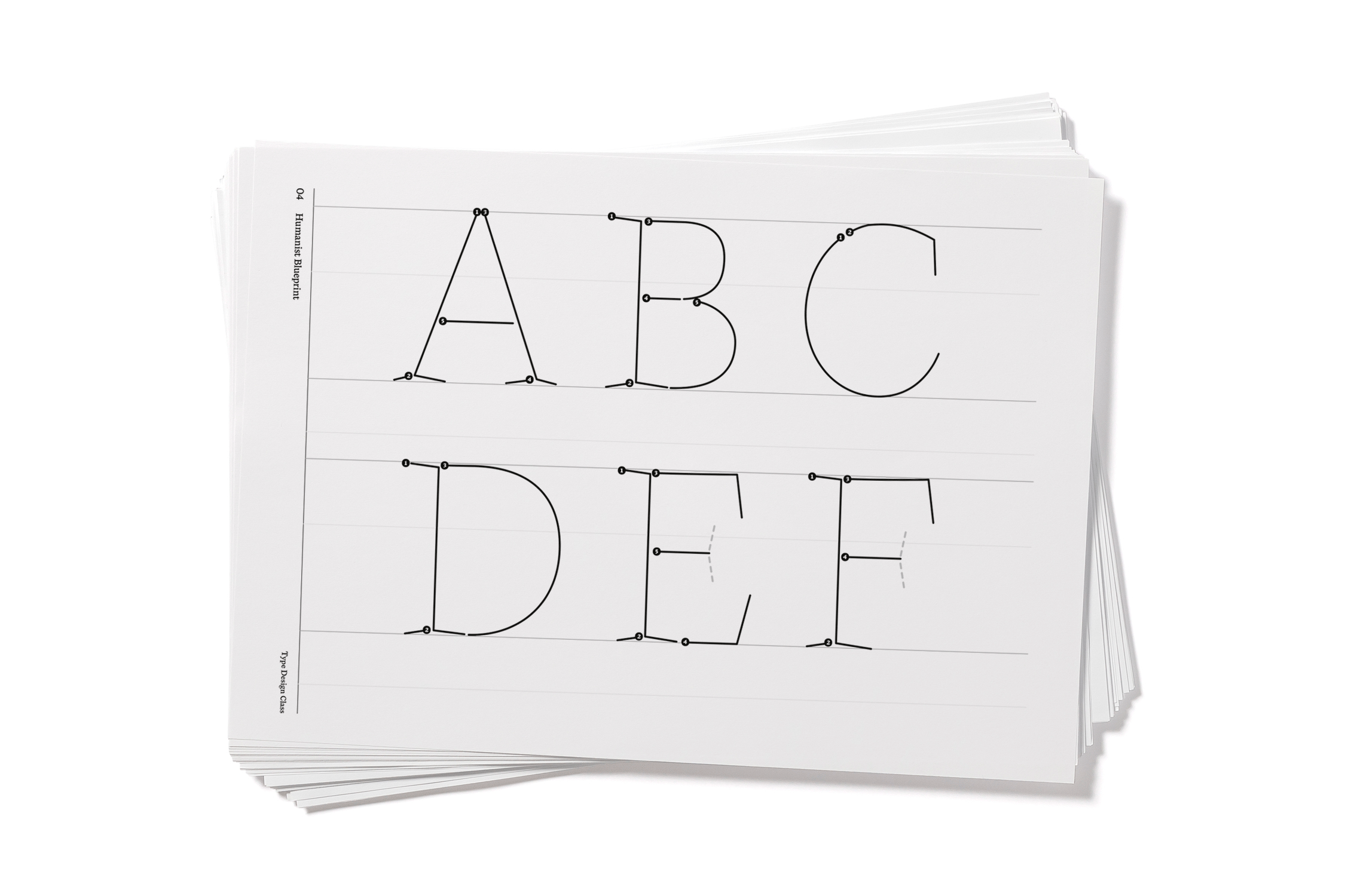
The proportions of Humanist letterforms come from the movement of the stroke and tool rather than the geometric construction of the outline.
When you follow that stroke logic in this Blueprint, the alphabet begins to behave as a system. Letters will automatically share rhythm and proportions so you can focus on drawing the style of the letterform.


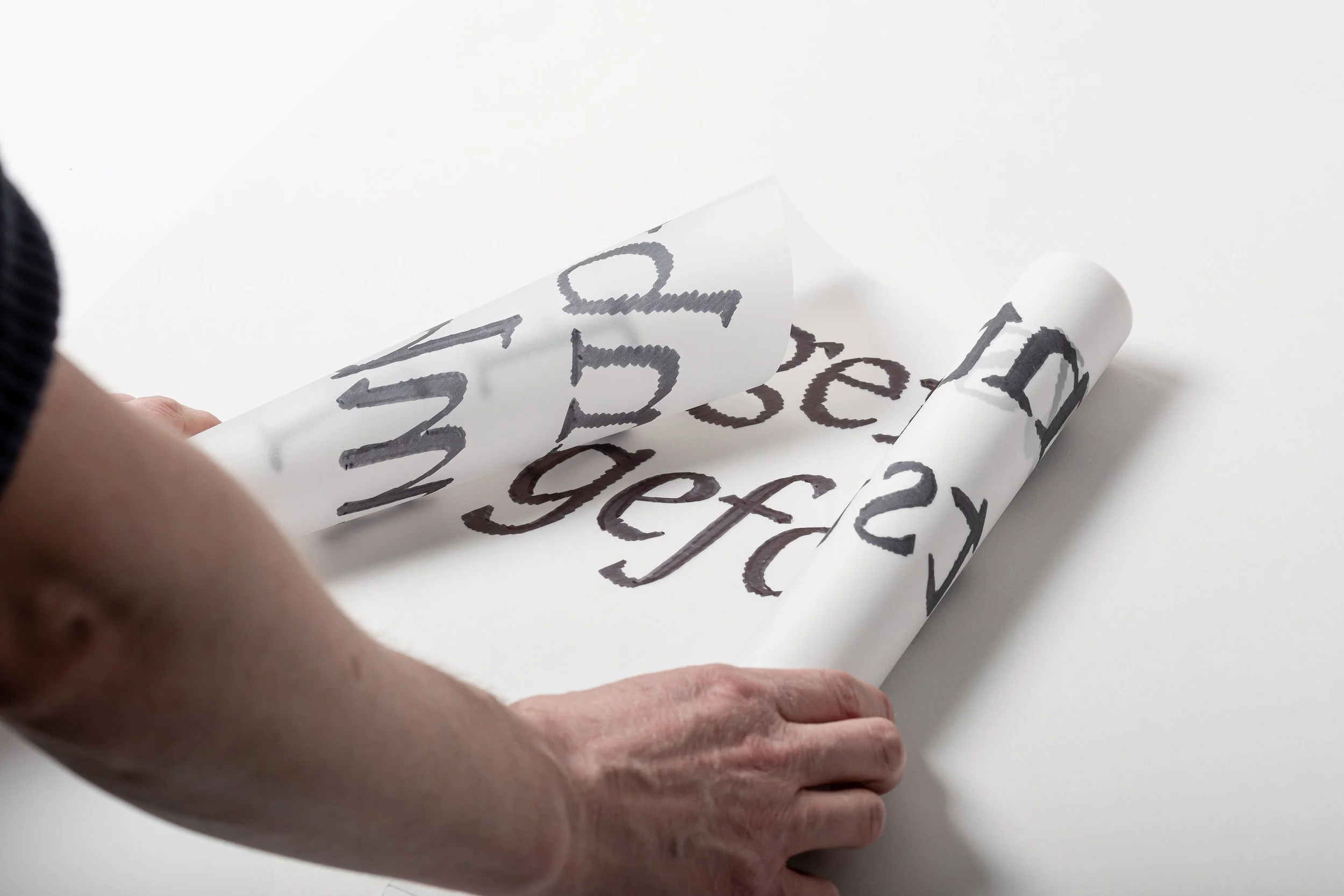

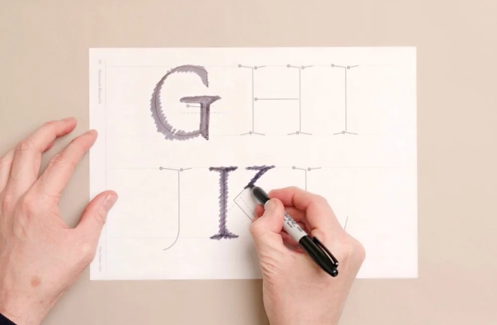
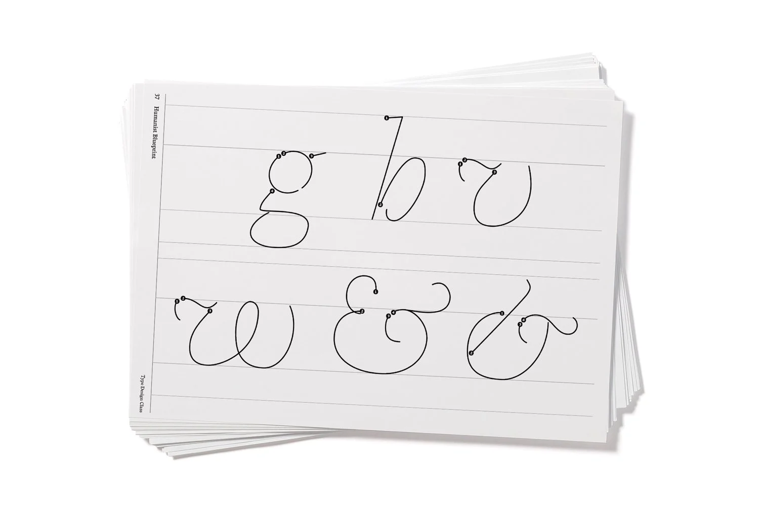
Follow the stroke
Each letter begins with numbered starting points. These numbers show the order of the strokes that build up the letter. Follow them one by one and the form appears naturally.
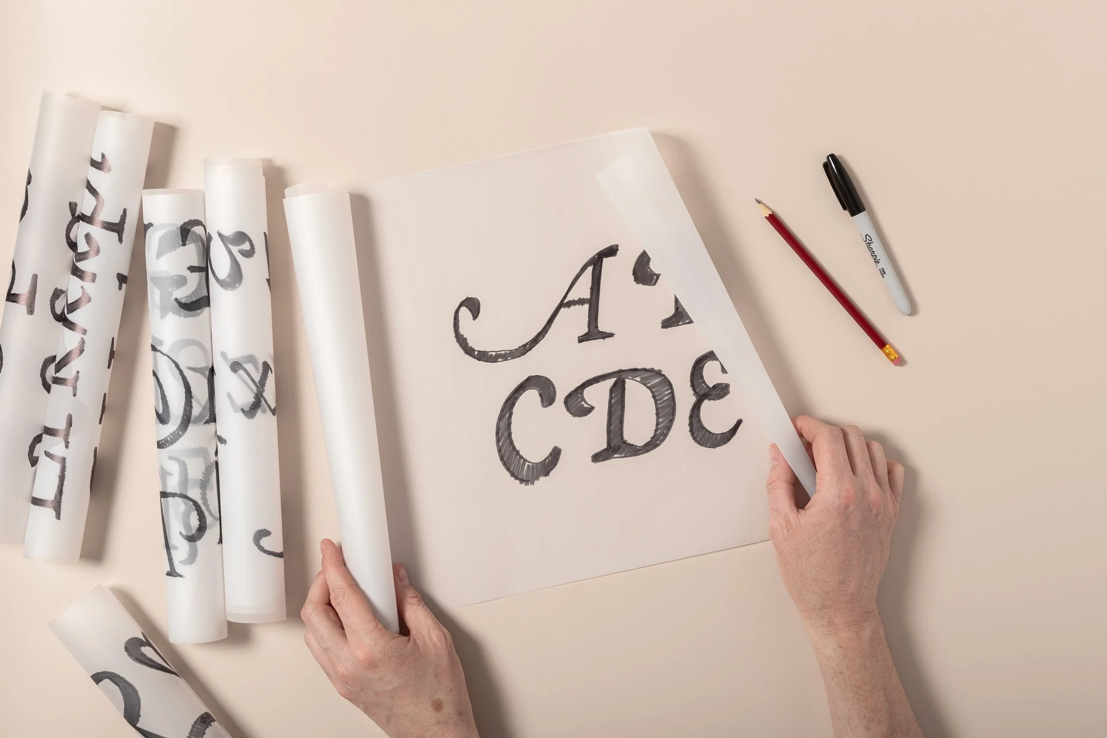
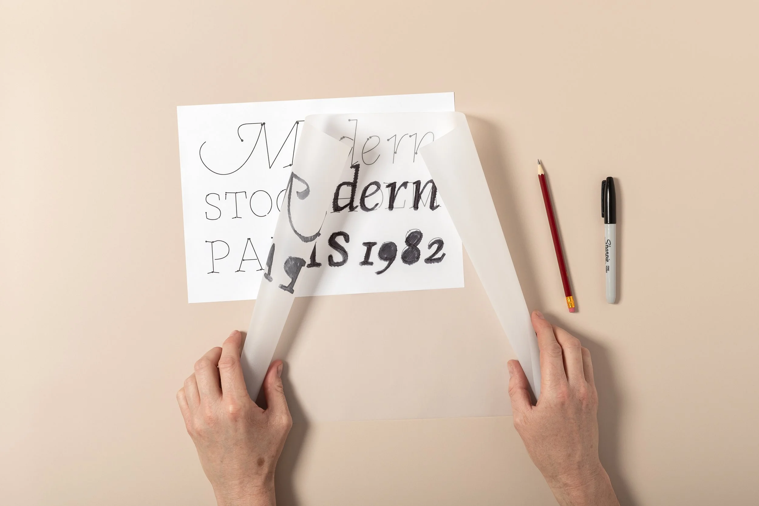
Start on paper!
This is not a course you need to “go through”. It’s something you open, use, and come back to whenever you’re starting a new font idea or trying to fix one that isn’t quite working yet.
Included in the Blueprint:
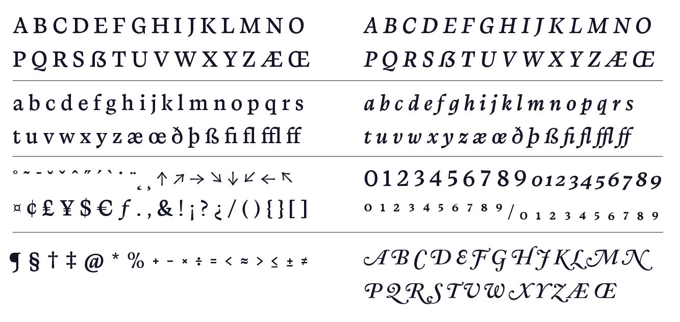
The Humanist Blueprint provides the structural framework for building a complete Wester European typeface. It includes 264 essential components needed for text fonts.
+ Helpful Instruction Video
What you need:
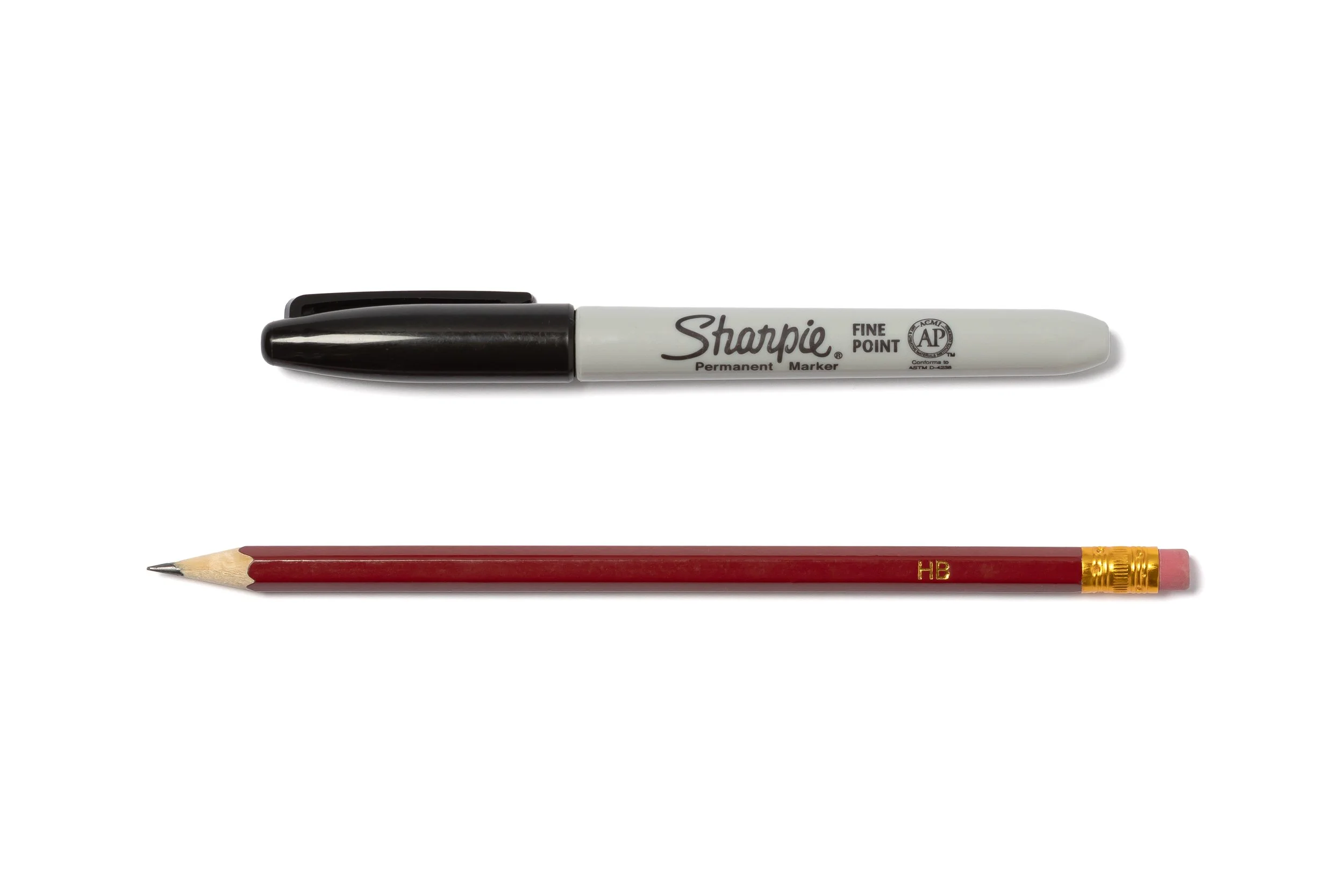
Marker or Pencil
The Humanist Blueprint

Tracing paper

WHAT PEOPLE SAY
“Incredibly easy to use. The Blueprint has already been a great addition to my workflow”
Yuriy Starikov, designer

WHAT PEOPLE SAY
“It’s wonderful to see how intuitively the letterforms seem to draw themselves”
Manuel Viergutz, type designer
When the proportions are correct, drawing letterforms becomes much easier.
The Humanist Serif Blueprint gives you the structural foundation. From there, the style is entirely yours. You simply follow the strokes and start drawing.
About
Viktor Baltus

This blueprint began as a practical necessity. While designing my own serif typefaces I kept running into the same questions that you probably face.
How wide should the W be, how narrow can the Z become and why do certain letters always seem to require endless correction?
Historical typefaces clearly contained solutions. But those solutions were hidden inside finished designs rather than explained as structural principles.
So I began mapping the relationships myself.
By studying historical models and testing proportions through drawing, the structural logic of the alphabet gradually revealed itself. What started as personal notes evolved into a clear framework.
That framework became the Humanist Blueprint.
It is the reference I wish I had when those problems first appeared.

The Humanist Blueprint
Draw your own Humanist typeface with a solid foundation. With uppercase, lowercase, figures, punctuation, accents and diacritics, italics & swashes.
✓ Easy to learn with helpful video
✓ Start now, at your own pace
✓ Gain full control of your letterforms
✓ Grow your font making skills