Space and Kern your font
Setting a font’s spacing and kerning can be an important step in the design process because it ensures that the letters fit together properly and have a pleasing appearance. It is crucial to understand how a font's letter forms and spaces interact because this relationship has a significant impact on the text's legibility, readability, and overall appearance. To achieve the desired result, various factors such as letter height, width, and spacing, as well as the relationships between specific letter pairs, must be carefully considered. In this blog post, we'll look at two important aspects of font spacing: side bearing values and kerning.
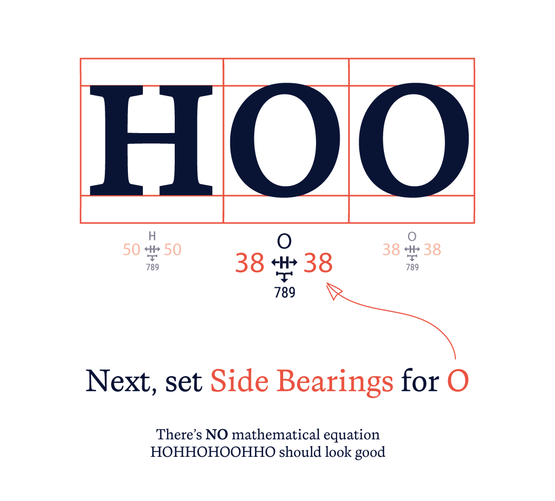
Correct font spacing can frequently solve a sizable portion of kerning problems. This is because proper spacing lays the foundation for good kerning, as it establishes a consistent rhythm and flow throughout the text. If the side bearing values are not set correctly, it can lead to awkward spaces between letters, which can negatively impact the readability and aesthetic of the text. You can eliminate many kerning issues by making sure that the side bearings are set correctly, which allows you to concentrate on perfecting particular letter pairs rather than having to address a greater number of spacing problems throughout the entire font. By providing a baseline for the distance between letters, setting the side bearing values enables a more targeted approach to kerning.
As a result, kerning becomes more effective and less time-consuming, as you can concentrate on making adjustments to only those letter pairs that require attention.

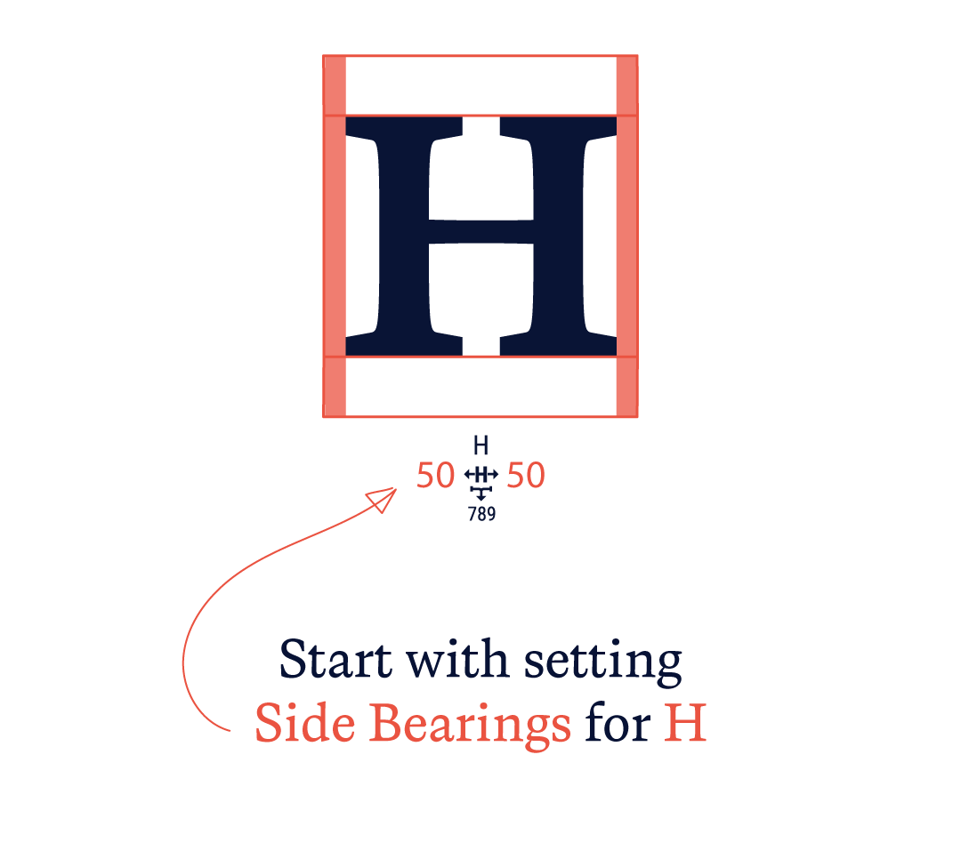
Start with setting your side bearings
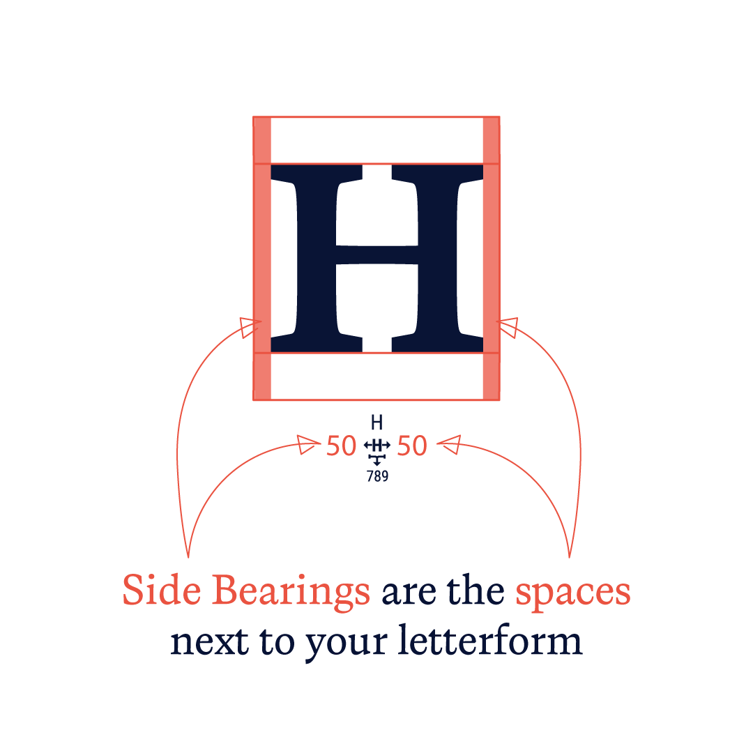
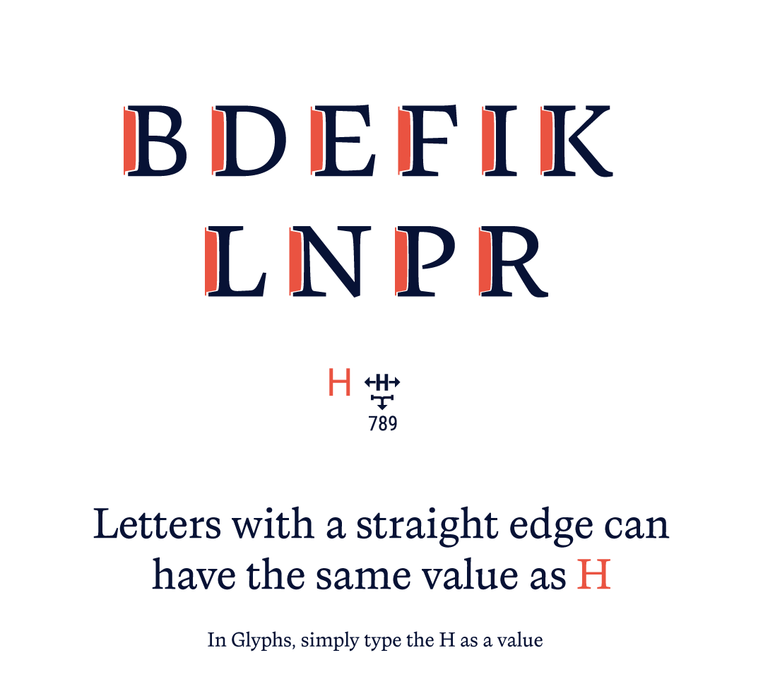
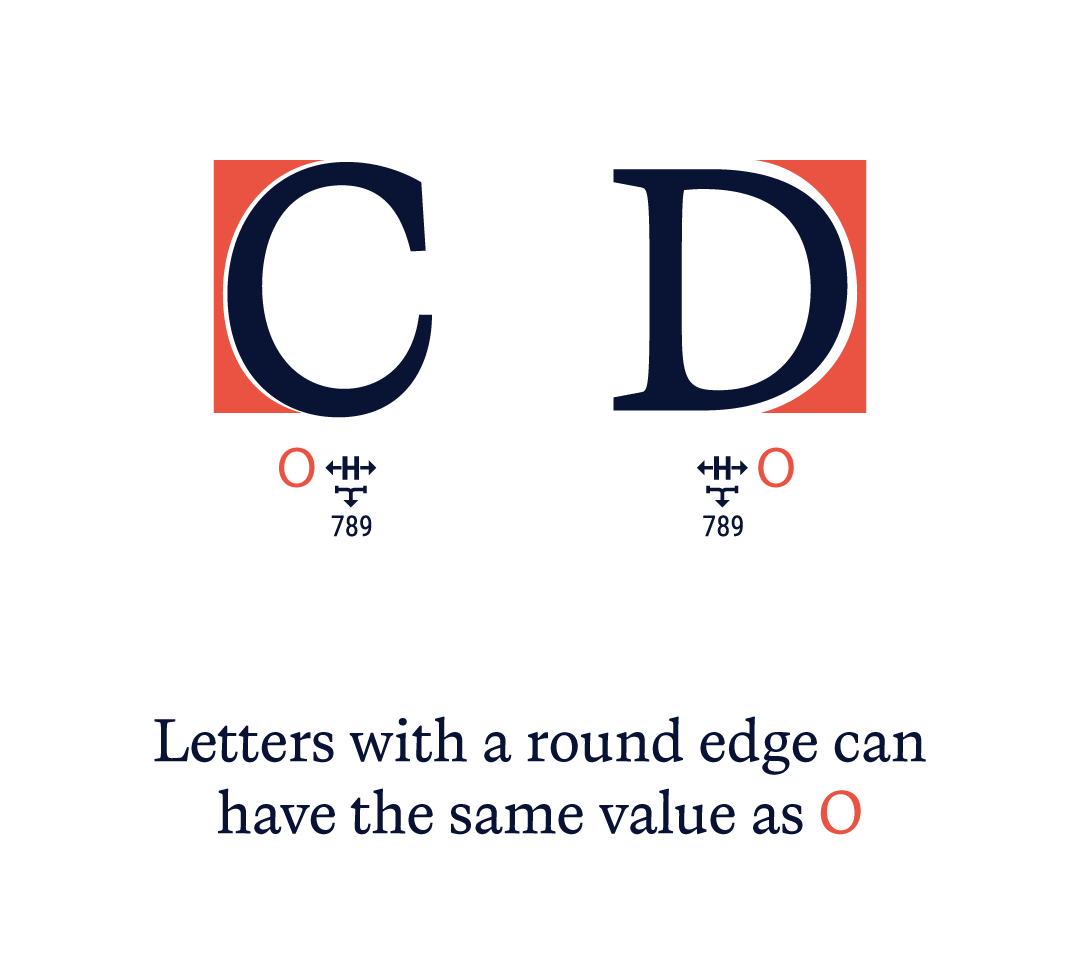
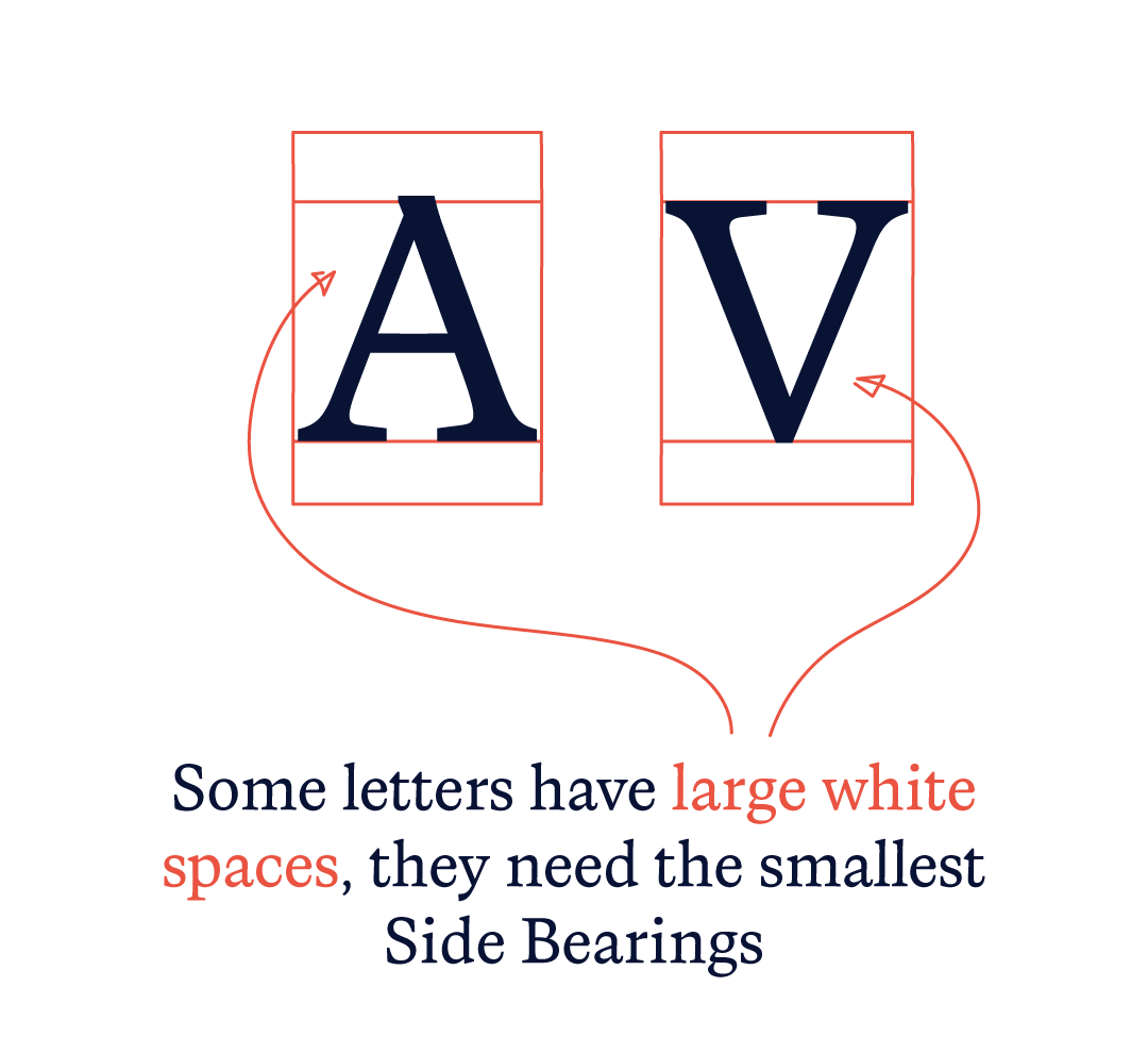
The distance between the letter shape's edge and the imaginary vertical line (also referred to as the advance width) that divides one character from the next is determined by the side bearing values. These numbers are significant because they have an impact on the text's overall spacing and readability.
As the presence of serifs can affect the spacing and kerning of the letters, spacing a serif style font can be a little different from spacing a sans-serif font. However, with the right approach and tools, it can be done effectively.
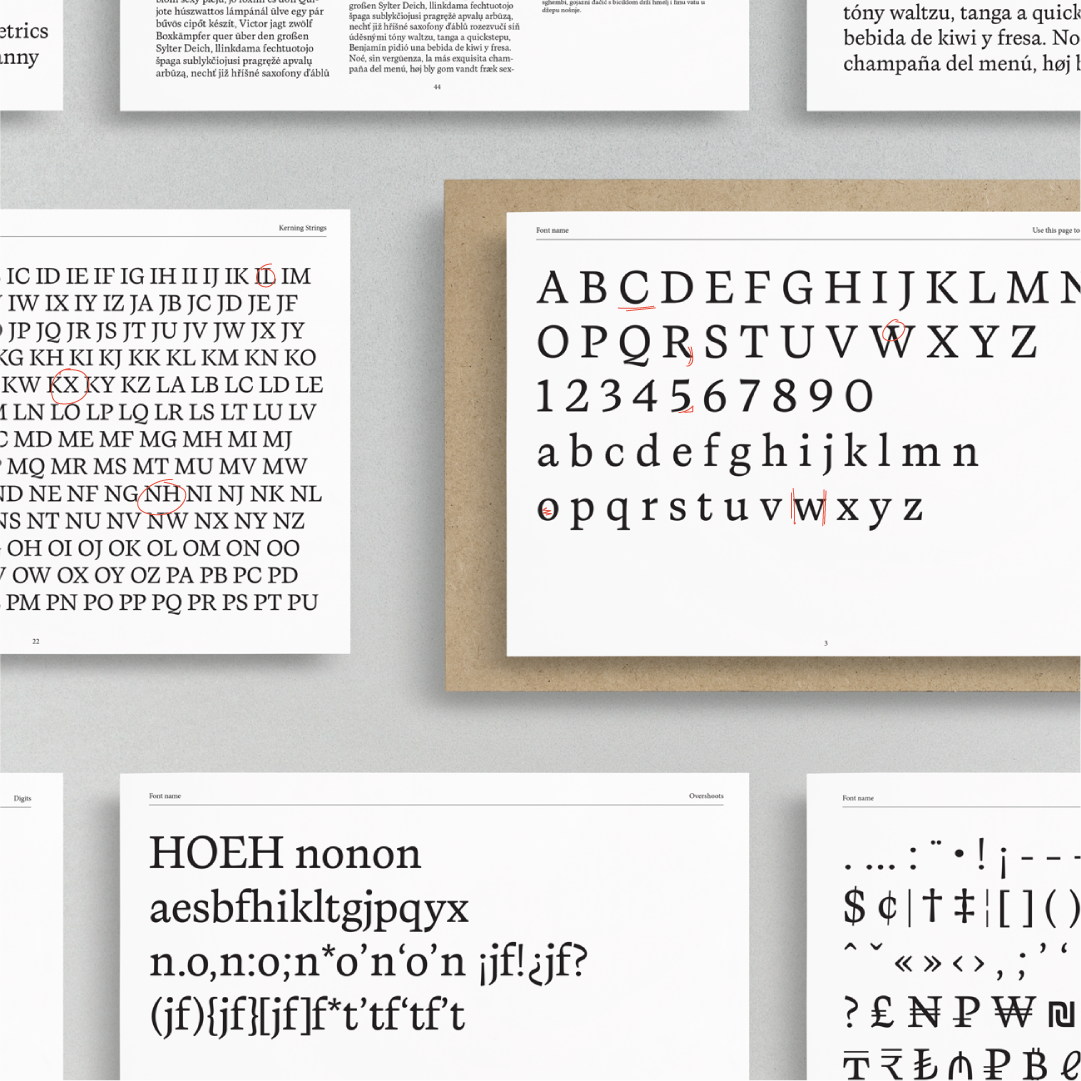
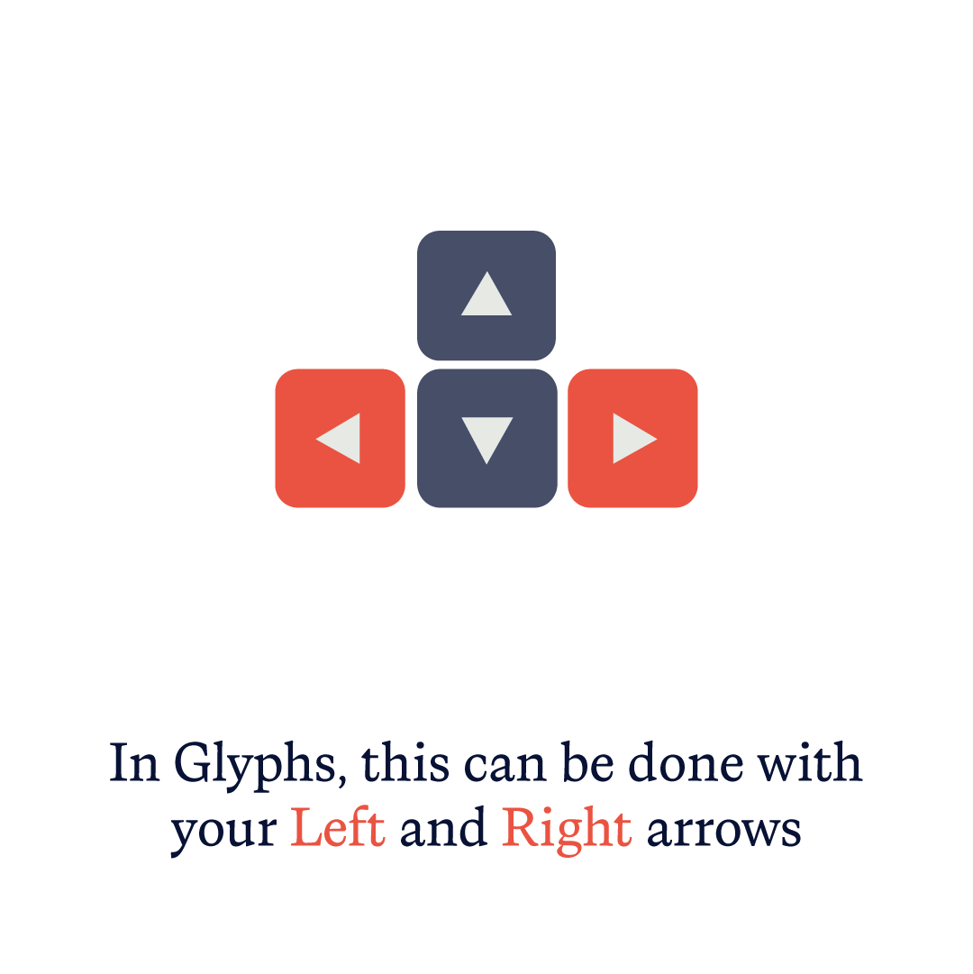
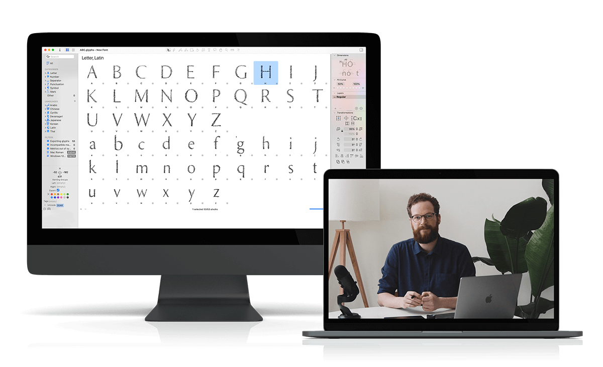
By selecting the character in the Font View and then modifying the values in the Metrics section of the Inspector Panel for each character in Glyphs, you can set the side bearing values for each character. The left side bearing value indicates the separation between the character's left edge and the vertical line, and the right side bearing value indicates the separation between the character's right edge and the vertical line.
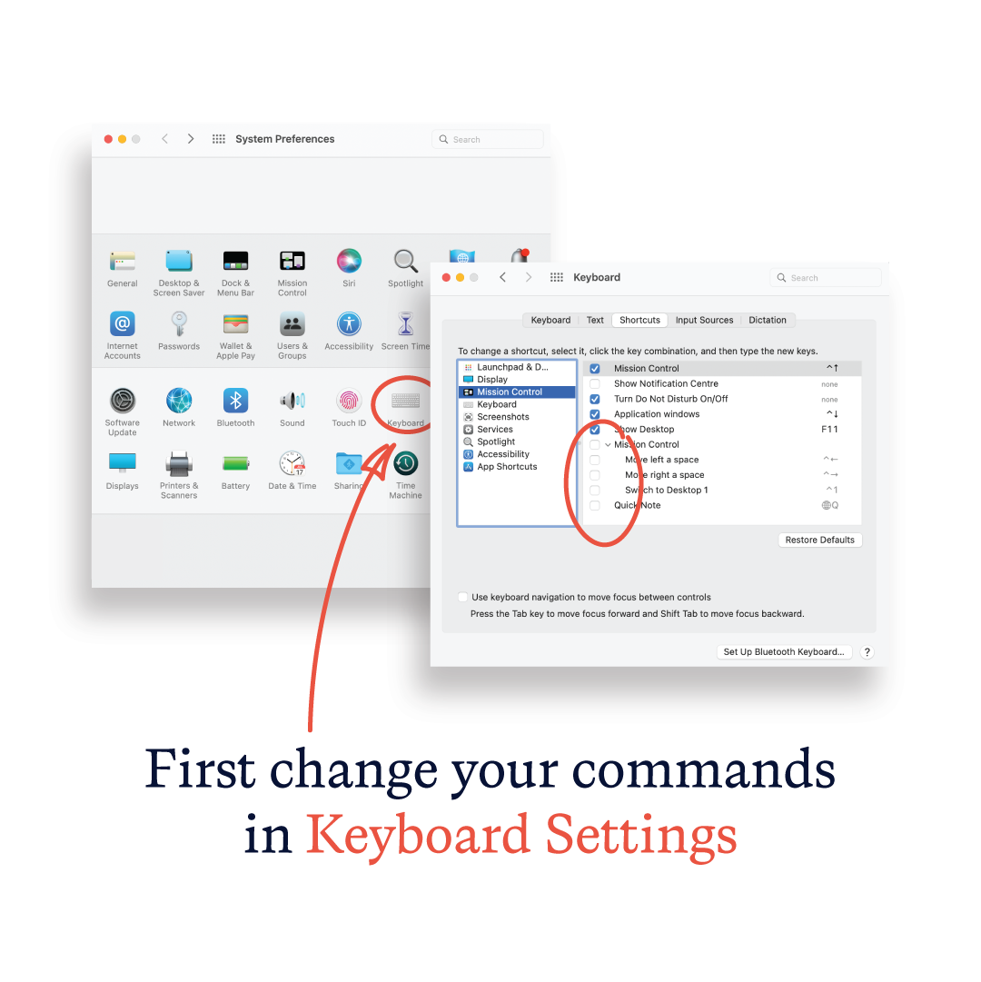
The steps below should be followed to set the side bearing values in Glyphs:
Next: set your Kerning
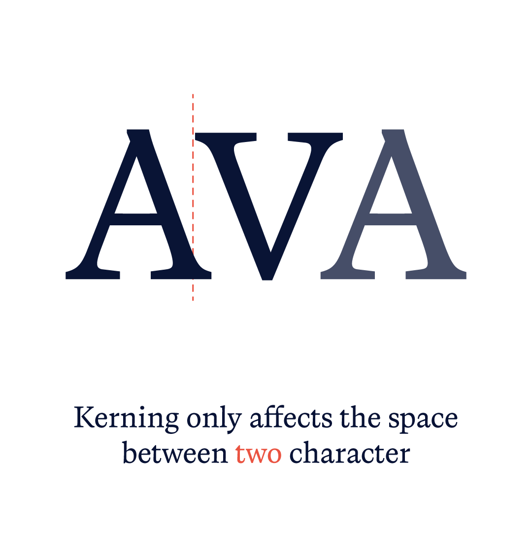
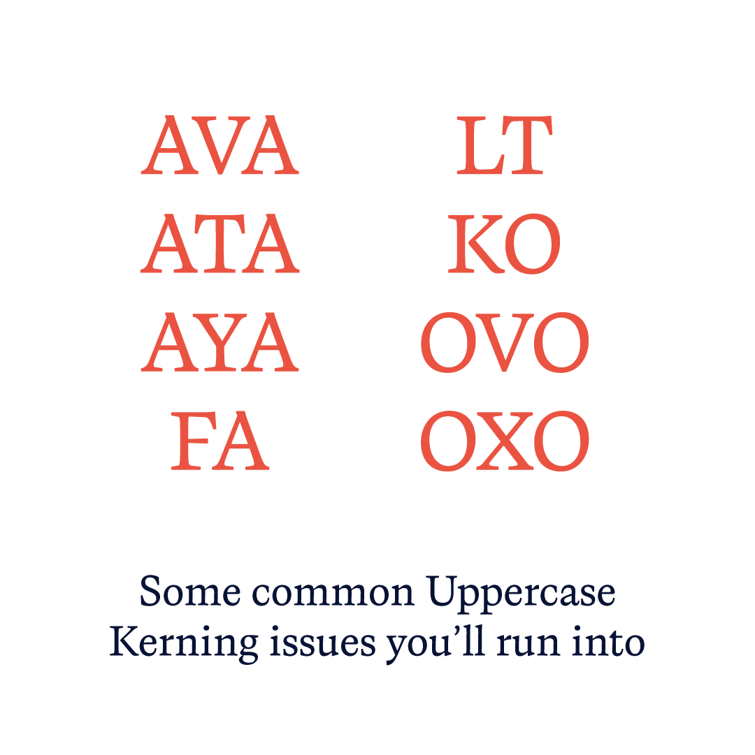
Adjusting the distance between two particular characters in a font is known as kerning. With larger typefaces in particular, kerning aims to create a text that is visually balanced and appealing to the eye.
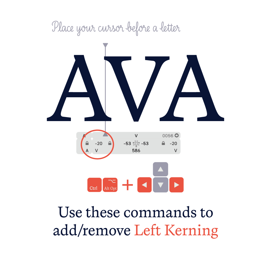
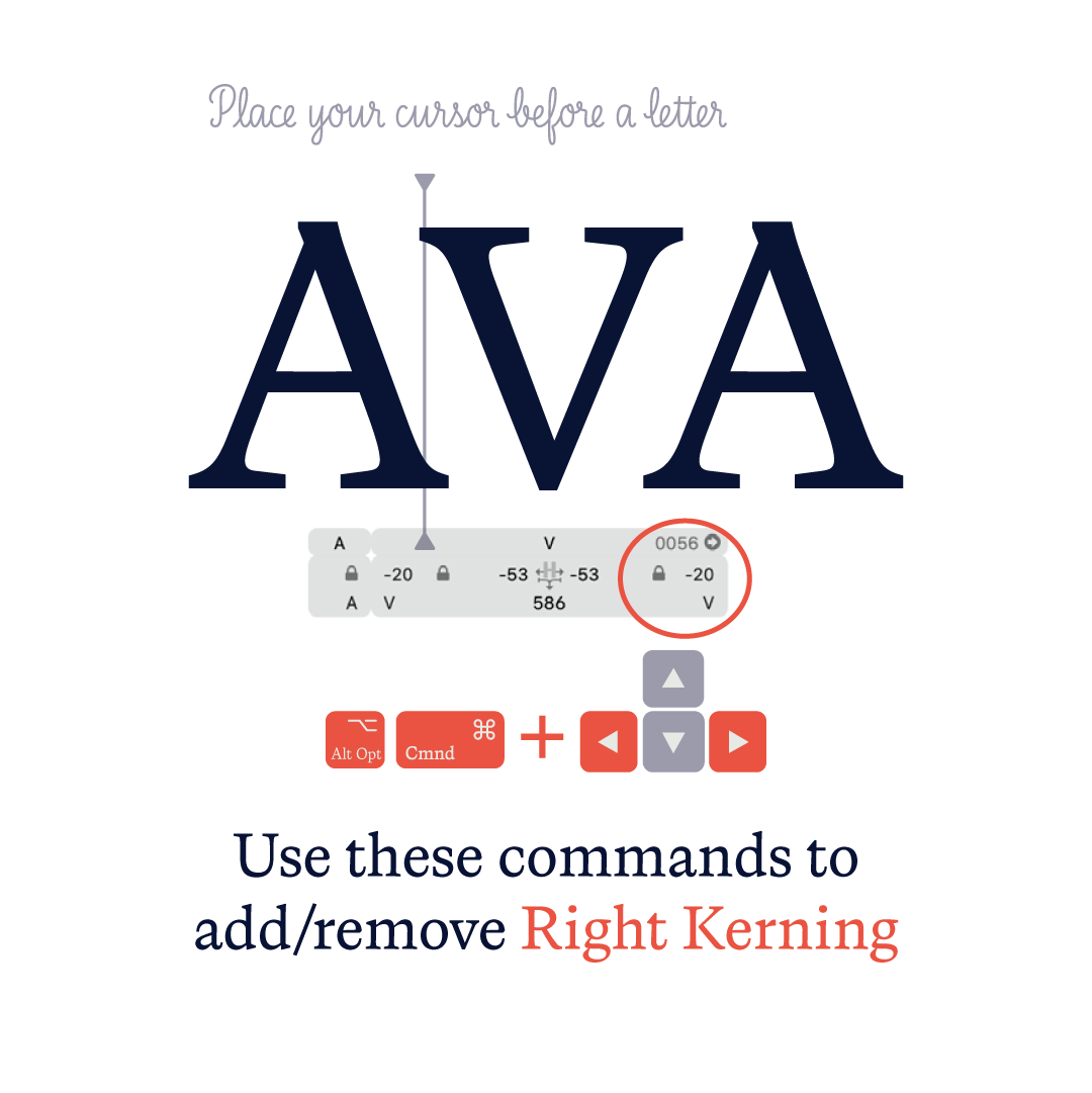
By using the Kerning section of the Font View in Glyphs, you can modify the kerning values for particular character pairs.
Follow these steps to set kerning values in Glyphs:
Side bearing values and kerning are two crucial components of font spacing that can have a significant impact on your typeface’s readability and overall aesthetic. You can make sure that your font has the right spacing and appears visually appealing by modifying these values in Glyphs.
Learn to make your own fonts.
From start to finish
Join the Font Making Course now and expand your skill set