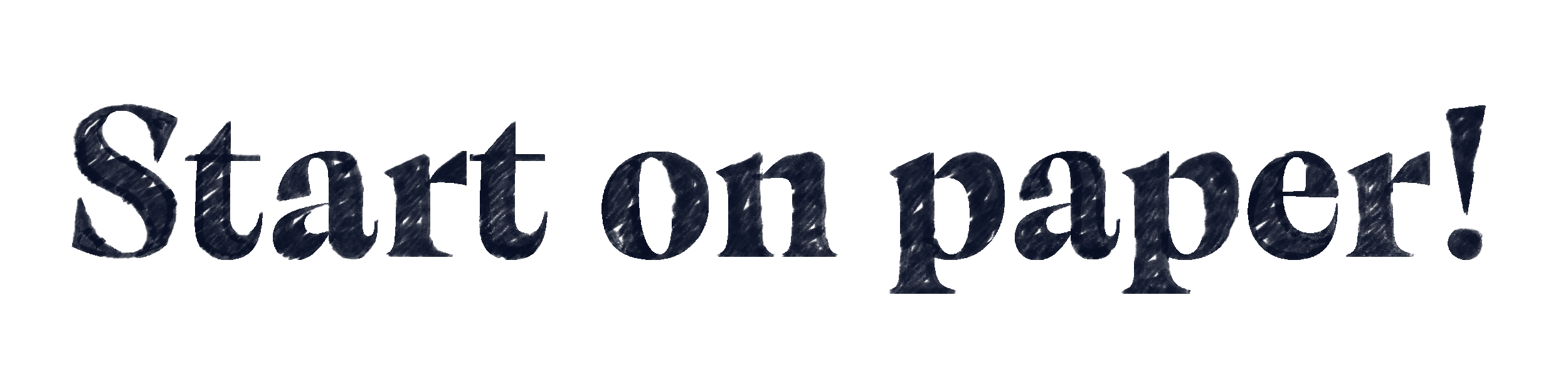
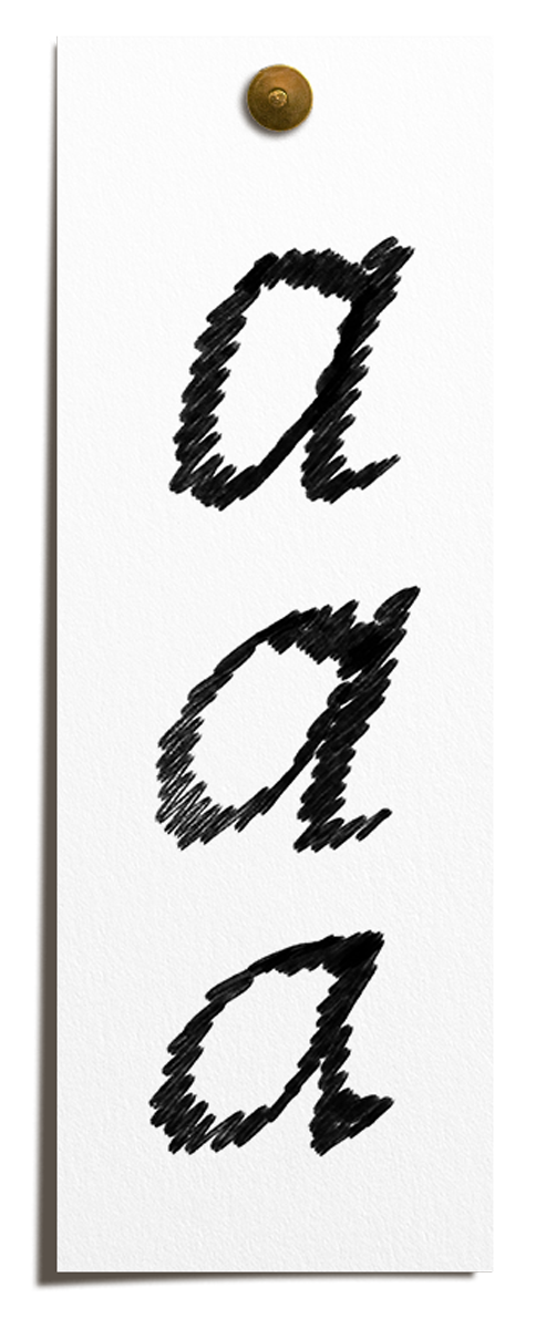
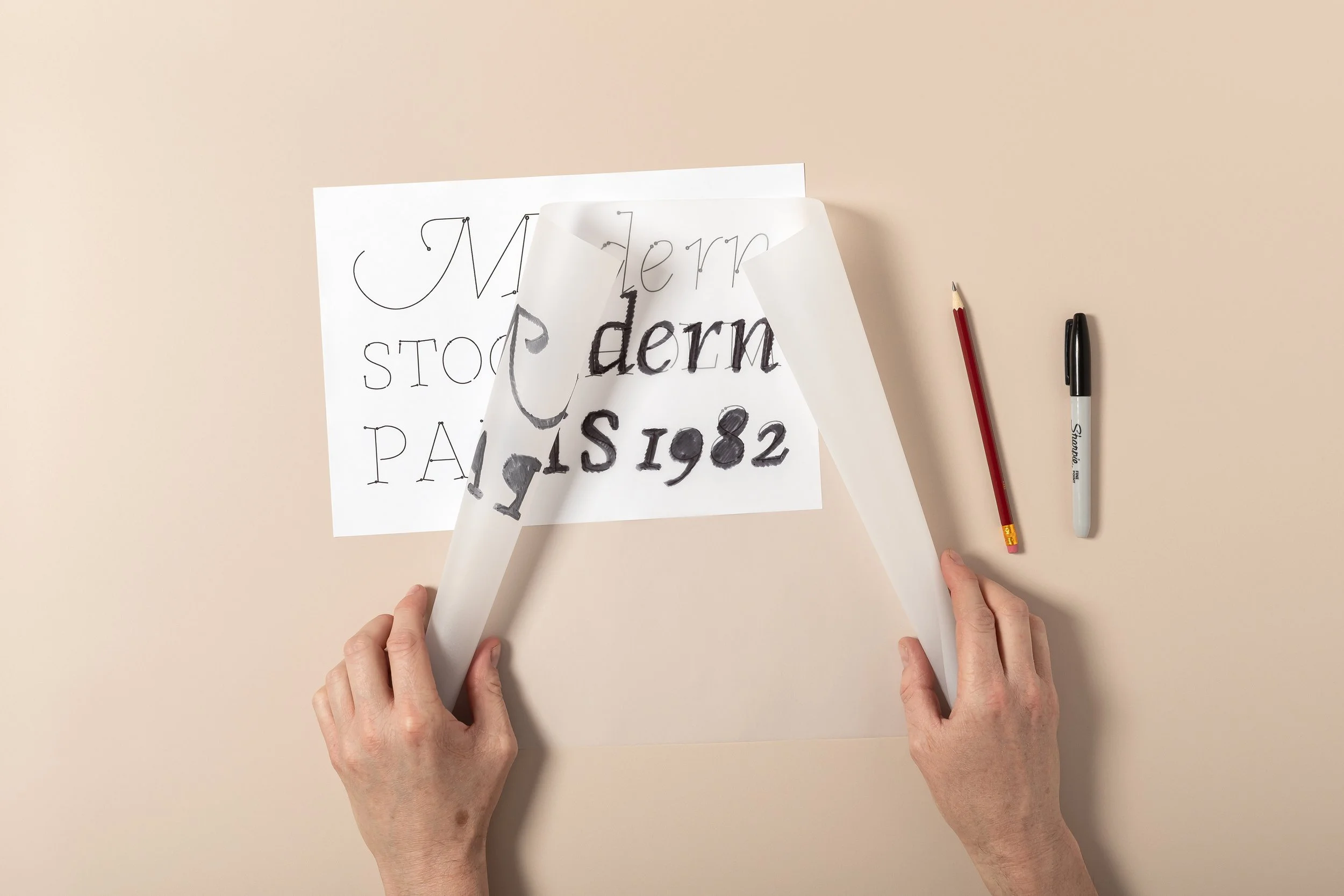
Start on paper! With a solid foundation
In Sketch Your Fonts I’ll teach you 8 proven techniques to design fonts. For Beginners to Experts.
✓ Never run out of inspiration
✓ Start now, at your own pace
✓ Draw along with the videos
✓ Improve your fonts
$179


This hands-on video course is designed to teach you how to sketch fonts by hand. From the first rough lines to refined letterforms, using only pencils, markers, and paper.
This is NOT a calligraphy or hand-lettering course. You won’t be learning how to write decorative script or brush lettering.
Instead, you’ll learn how to draw letterforms from scratch, the way type designers have done for centuries. This course is also about coming up with new ideas, how to never run out of inspiration and stress-test your ideas.
No computers. No digital tools.
Just your sketchbook and the techniques you need to bring your ideas to life.
Why it’s important to sketch your own fonts?
Sketching a font by hand is the best way to:
Develop a deep understanding of letterforms, structure, and balance.
Create truly unique fonts that don’t just mimic existing designs.
Train your eye to spot details that make typography more refined and expressive.
Think like a type designer before ever opening font-making software.
Even if you don’t plan to digitize your sketches, learning this process will enhance your creative skills and appreciation for typography.
What you’ll learn in this course
How to generate unique font ideas, so that your designs always stand out.

8 proven techniques for drawing type, so that every letter is visually appealing.

How to refine and perfect letterforms, so that your fonts eventually look polished and professional.

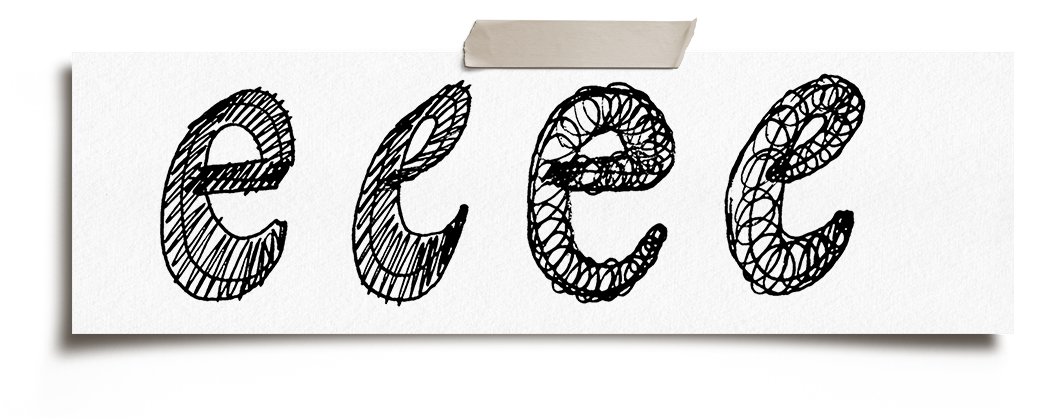
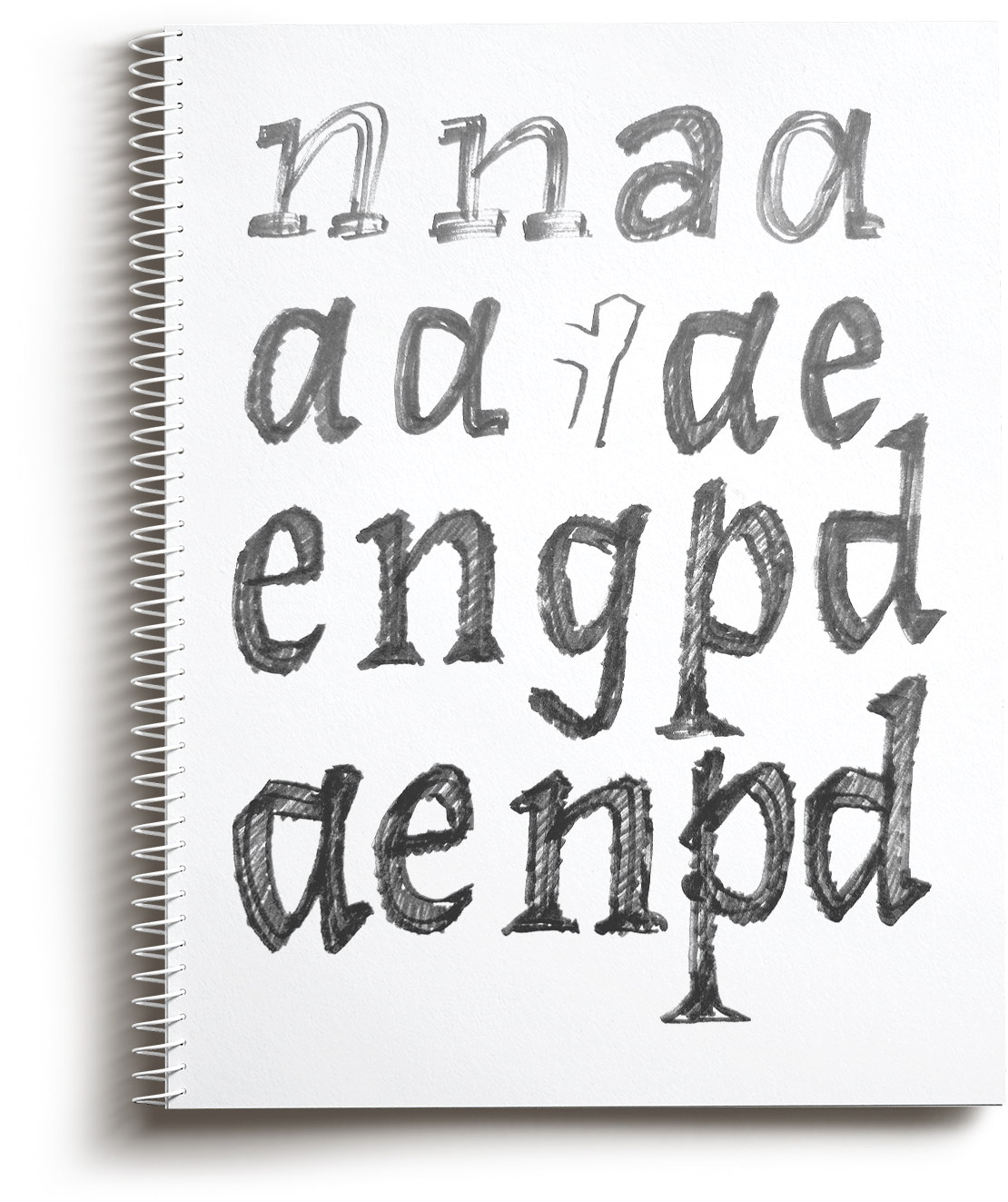
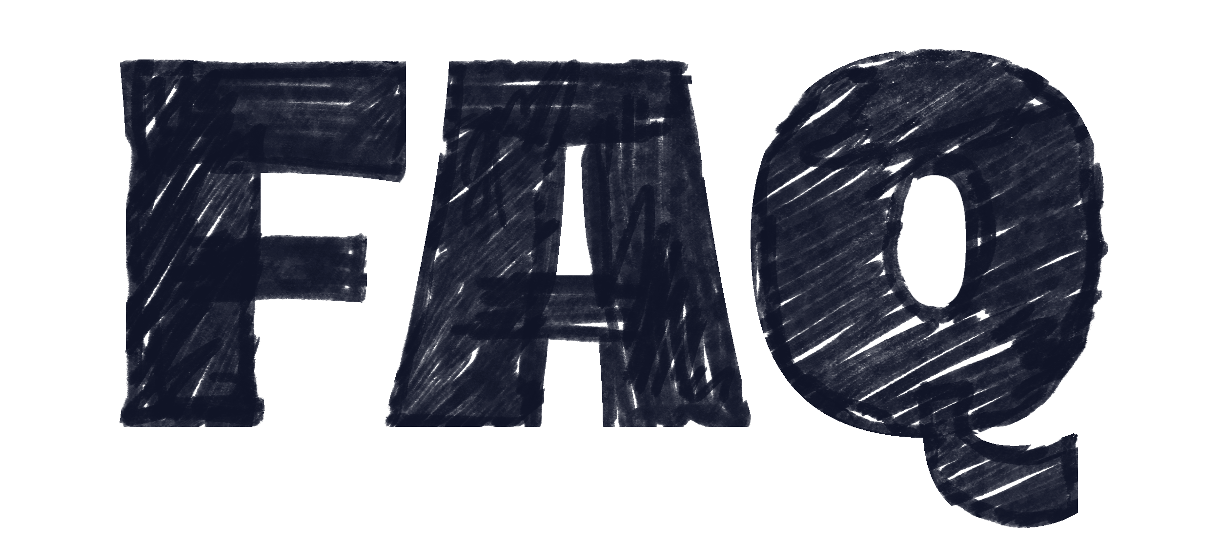
What you’re about to learn are eight practical methods. Each one sharpens a different way of seeing and drawing letterforms. No life hacks. No styles of lettering. Just simple exercises that type designers have relied on for decades because they work. Some of them will feel fast, others slow, ASMR-style like.

WHAT PEOPLE SAY
“Highly recommended for anyone who wants to learn type design, not just the software”
Yuriy Starikov, designer
The Lessons
-
An introduction to how this course approaches sketching. Focused on speed, clarity, and generating ideas that can actually turn into type.
-
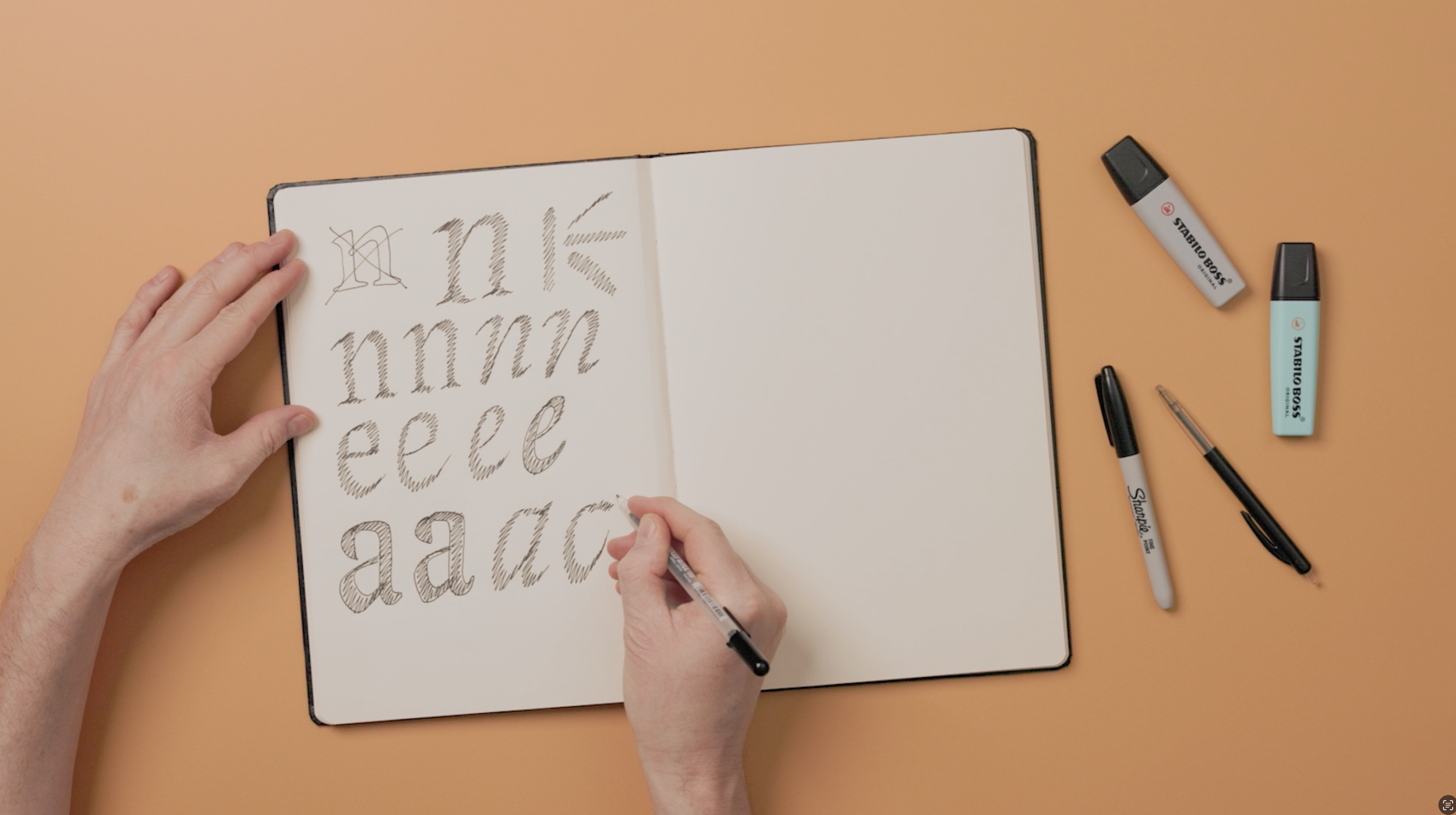
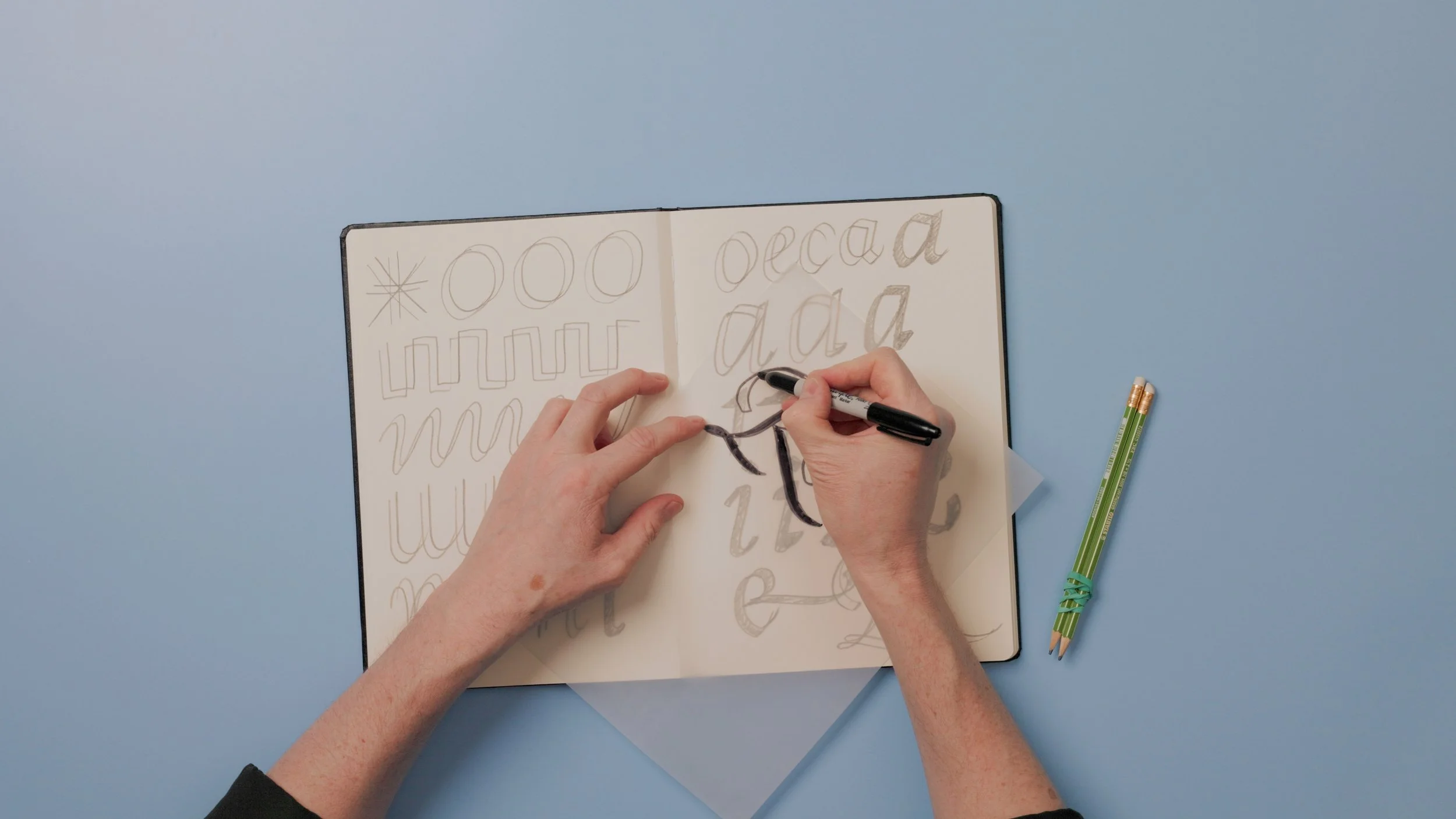
Drawing is cheap! A small selection of tools that support loose, fast sketching. Nothing excessive, just what contributes to better results on paper.
-
Core principles behind strong letterforms. Proportion, rhythm, and consistency, applied in a practical way while sketching.
-
An overview of the different approaches used throughout the course. Each technique offers a distinct way into drawing and developing ideas.
-
Using existing logos as a starting point for new letter ideas. A way to build variation and direction from material that already works.
-
A method that introduces contrast and movement into sketches. It creates more dynamic letterforms with minimal effort.
-
A shape-based approach to constructing letters. It shifts the focus from outlines to structure and proportion.
-
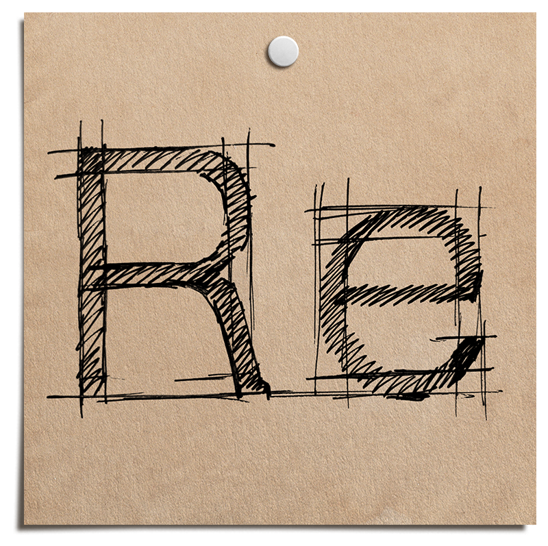
The underlying framework of letterforms. These sketches define how everything else will sit and relate.
-
Working with historical material to build a stronger sense of proportion and form. A direct way to train both eye and hand.
-
The parts of the alphabet that carry consistency across a typeface. They tie individual letters into a system.
-
A simple technique that produces contrast through a single movement. The result is immediate variation in stroke weight.
-
Different tools lead to different outcomes. Changing them introduces new forms and breaks repetition in the work.
-
Shaping rough sketches into a clear direction. This connects individual ideas into a consistent concept.
-
Early evaluation of sketches across multiple letters. It reveals whether an idea holds up beyond a single character.
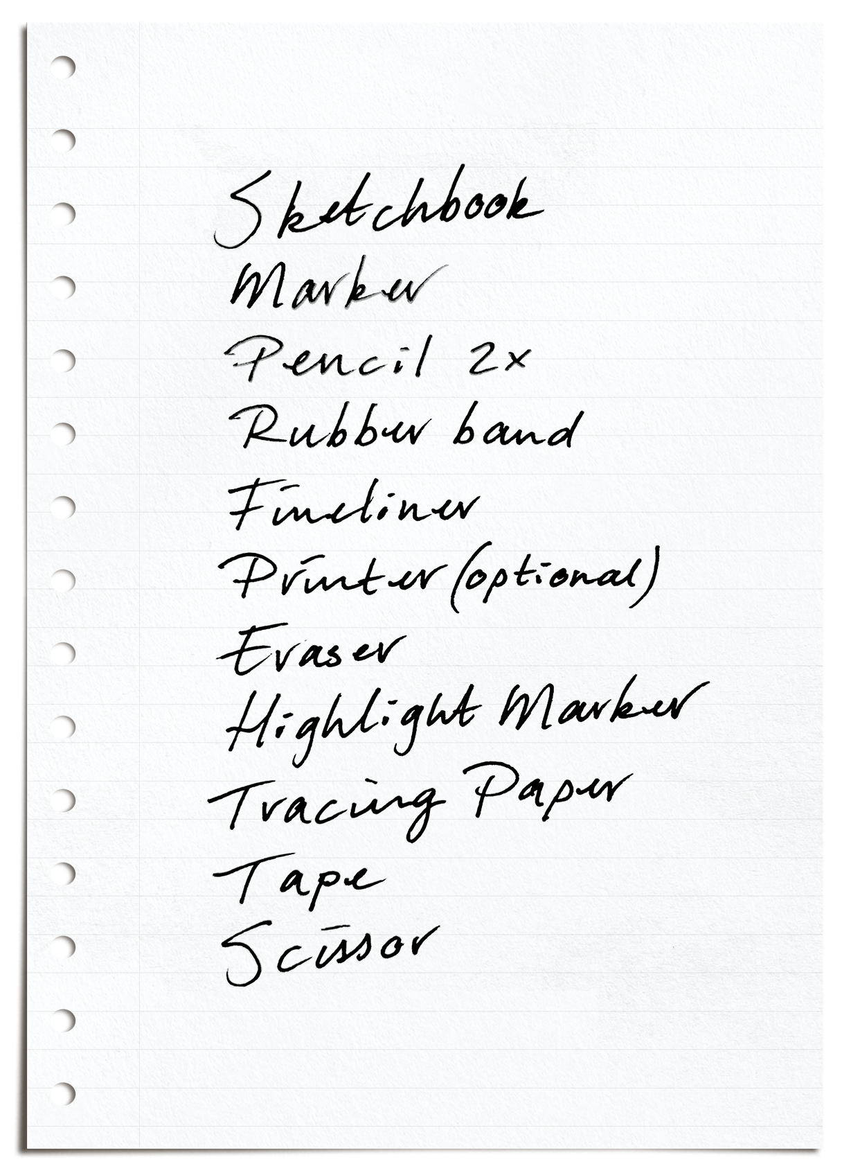
The tools you’ll need
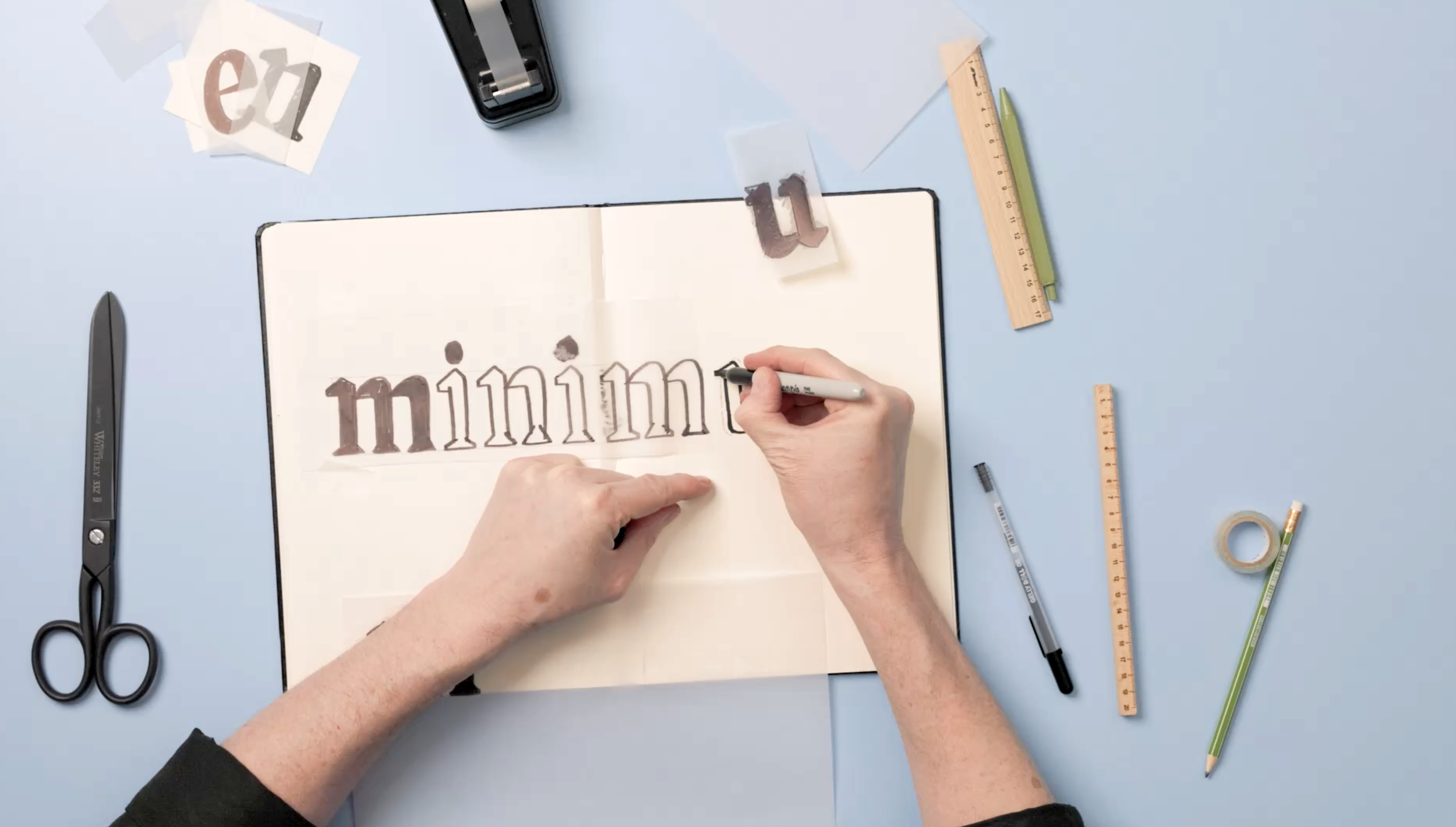
Drawing is CHEAP. You don’t need fancy tools or equipment. I’m not going to bring you into debt before starting with recommending certain brands. Expensive tools won’t make your drawings any better. What you’ll need, and what I use in this course is:
Sketchbook A4 | Marker | Pencils + rubber band | Fineliner | Printer (optional) | Eraser | Highlight Marker | Tape | Tracing paper | Scissor

WHAT PEOPLE SAY
“Type design was the creative outlet I needed, and I've fallen in love with it. It wouldn't have been possible without Viktor!”
Carissa Allen, designer
Who is this course for?
This course is perfect for:
Type Designers who want a better understanding of letterforms.
Graphic Designers looking to add hand-drawn fonts to their skillset.
Illustrators & Artists interested in exploring letter design.
Anyone who loves sketching & creativity!
No prior experience is required, just a love for typography and a willingness to experiment with pencil and paper.
How it works
Step-by-step video lessons. Watch, learn, and sketch along at your own pace
Hands-on exercises. Practice each concept with guided drawing exercises
No software needed. This is a completely paper-based course (except for a computer with Internet connection or our platform app to watch the videos of course)
Work at your own pace. Rewatch lessons and refine your skills anytime
All you need is a sketchbook, some pencils, and a love for typography.
On top of all the videos, you’re also going to gain access to these exciting Bonuses. I’m confident that you’re going to love them just as much!
The Humanist Blueprint Words Edition
This bonus gives you a simple way in. Instead of working through a full alphabet, you’ll start with carefully chosen words so you can focus on the movement, rhythm, and flow without getting lost in details. Just follow the strokes, repeat them a few times, and you’ll feel how the forms come together. It’s a quick, low-pressure way to understand the system and build confidence before moving on to the full Humanist Blueprint.
Feedback on your process
Got stuck, overthinking a curve, or not sure why something feels off? You can ask me anything along the way. Whether it is a quick check, a second opinion, or a deeper question about your sketches, you will have direct access to guidance when you need it. You get clear answers so you can keep progressing without second guessing your work.
Easy to Follow
Comprehensive, to-the-point, modules you can do at any time
No Software needed
All you need for this course is a laptop or phone to watch the modules
At Your Own Pace
Learn at your own pace, in your own time, anywhere in the world
Sketch Your Fonts is always available and an ideal starting point before the joining the Font Making Course.
Meet your instructor:
Viktor Baltus


I created this course because sketching is often treated as a loose, informal step in type design, when in reality it is where the most important decisions happen. It is where rhythm, proportion, and personality are first discovered. Learning how to sketch changes how you build type entirely.
In Sketch Your Fonts, I teach a structured way of drawing letterforms that connects traditional calligraphic logic with modern type design practice. The goal is not to make perfect sketches, but to make understanding visible so your ideas can grow into fonts with clarity and control.
My teaching style is direct and practical, focused on breaking complex ideas into steps you can actually use. Whether you are new to type design or refining your workflow.
Sketch Your Fonts is about learning how to see shapes properly before you ever start building a font.
What people say about my courses
-
![Close-up of a man with curly brown hair, glasses, and a beard smiling outdoors.]()
"I absolutely love the Font Making Course, and find myself returning to the lessons regular. There’s so much knowledge to glean here!"
Elliot Jay Stocks
-
![Black and white portrait of a woman with wavy hair, looking pensively at the camera with her hand resting on her neck, near a window with curtains.]()
"I'm so grateful to have taken this course, because without Viktor I wouldn't be where I am today."
Stacy ‘Blanc Salváge’
-
![A black-and-white portrait of a young man with dark, curly hair, looking to the side with a contemplative expression.]()
"I would highly recommend this course if you're serious about type, it will make you love it even more!"
Adam Vicarel
-
![Close-up portrait of a young woman with short, dark hair, multiple piercings, and wearing a gray sweater.]()
"I’m super happy with the course! I’ve created a typeface before, but following your process has definitely sped up my workflow, and I’ve discovered so many new tips that make this journey a bit easier!"
Mari Carmen del Valle
-
![A young man with short dark hair and a goatee, smiling, wearing a dark shirt, with a light background.]()
"Besides the very detailed structured course Viktor gives invaluable feedback. This is the perfect combination."
Michael Leonhartsberger
-
![A woman with shoulder-length wavy dark hair and light skin, smiling slightly, wearing a black top, against a plain white background.]()
"The course is full of useful knowledge and tips to learn and yet it is explained simple and easy to follow. So I was able to learn it step by step without being overwhelmed."
Saori


Frequently Asked Questions
-
Yes. Once you’re enrolled, you have the flexibility to start at your own pace, whether that’s next week, a few months down the road or even next year.
-
You’ll get full access to all videos, plus all the guidebooks. No need to wait for new content to appear, you can dive right in!
-
Yes! You can learn at your own pace, in your own time, anywhere in the world. Stuck with a technique? Simply scroll back in time and start over.
-
We encourage using good old paper and pencil. It’s cheap, accessible, and helps you focus on the shapes without tech getting in the way.
-
Not at all. This course is about exploring letterforms, not creating perfect art. If you can sketch a letter, you’re good to go.
-
Just some basic paper, a pencil or pen, and maybe an eraser. That’s it. No fancy supplies or brands required.
-
You can order your course on this page. You will receive an email with links and instructions for accessing the course material.
-
Let’s be honest, ‘life long access’ is not something you can really claim. You’ll have access to the course material for a minimum of 5 years.
-
Nope. This course is more about understanding letter construction, rhythm, and style by drawing. It’s a foundation that can help if you ever do want to design a full typeface later.
-
Sure, if you want I can help you figure out what needs to be improved in your skeches.
Any additional questions? Feel free to email us at info@typedesignclass.com
Sketch Your Fonts